

Spotlight on Yellow
/Yellow scares people.
Many clients I see make a point about their ambivalence, dislike or complete hostility towards it.
A few may be yellow-shy while some confess it looks ok on others but never them.
There are even complex cultural stigmas about wearing yellow in some communities.
Whatever the reason, there are a LOT of strong feelings out there!
Yet there is something quite extraordinary about yellow.
Join me on the yellow brick road to properly meet this most misunderstood of colours.

Don’t lie - you actually quite like yellow!
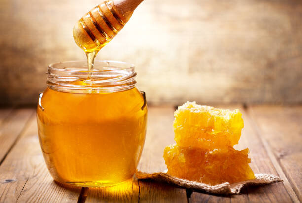
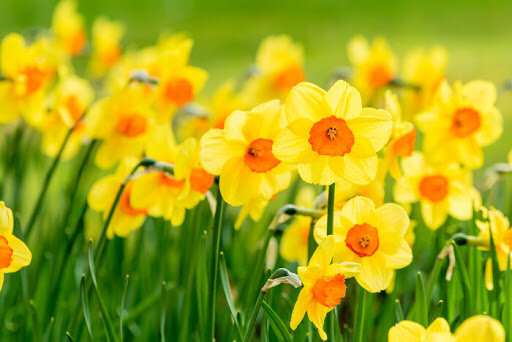
Sweeping wheat fields and honey, bright dawns, fresh fruit, autumn leaves, daffodils, sunshine on snow, lemon meringue pie and ducklings.
Yellow is delightful.

Studies demonstrate that people socialise more and with greater vivacity in yellow spaces.
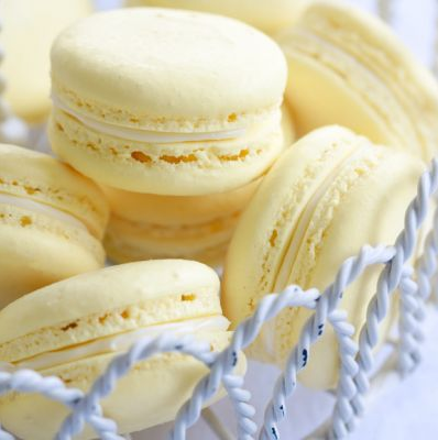
It’s the yummy colour of loads of things we like to eat.
For Westerners, yellow is cited as the happiest, most welcoming and optimistic of all colours.
Yellow is a powerful symbol of Chinese emperors.
It represents good fortune in Egypt, luck in Thailand and is sacred in many cultures.
Research shows that dressing in the right yellow makes a person look healthier and more vital compared with other colours.
So why don’t we love wearing it?


Yellow stands out.
Especially when pure, light and bright.
That didn’t come from nowhere, humans are naturally super sensitive to it.
Our brain processes yellow first, meaning we distinguish it easily from a sea of other colours that jumble together in our everyday.
There is a whole body of research around the evolutionary advantages of this phenomenon, not to mention the physics of wavelengths.
But the key point is that for humans, yellow is the most visible, naturally-occurring colour in the spectrum.
Our peripheral vision is more than twice as effective at recognising yellow than red.
Imagine the impact of that on the sporting field when selecting team jerseys!
This makes yellow extremely functional as a tool for conveying urgent and immediate messages.
No wonder it’s used to command attention in street signs, taxis and emergency services; why it’s perennially popular for logos and graphic design; and why it’s the “safety colour”.


Compare yellow with blue in this diagram from Elemental Colour.
Yellow is both high value (light) and high chroma (bright).
As a result, the colours we would typically describe as “yellow” are stacked at the top of the diagram.
Move away from maximum lightness or brightness and yellow becomes browner, greener or greyer as it drops in value and chroma.
In other words, yellow quickly turns into other colours, restricting the range of dark yellows.
But look at blue.
High value, high chroma blues aren’t much of a thing.
Most blues are about mid-range in value and the brighter versions aren’t also light as well.
Other colours compare similarly.
Only yellow has this unique combination of simultaneous high value/ high chroma.
And when bright and light combine in extreme proportions, our brain engages.

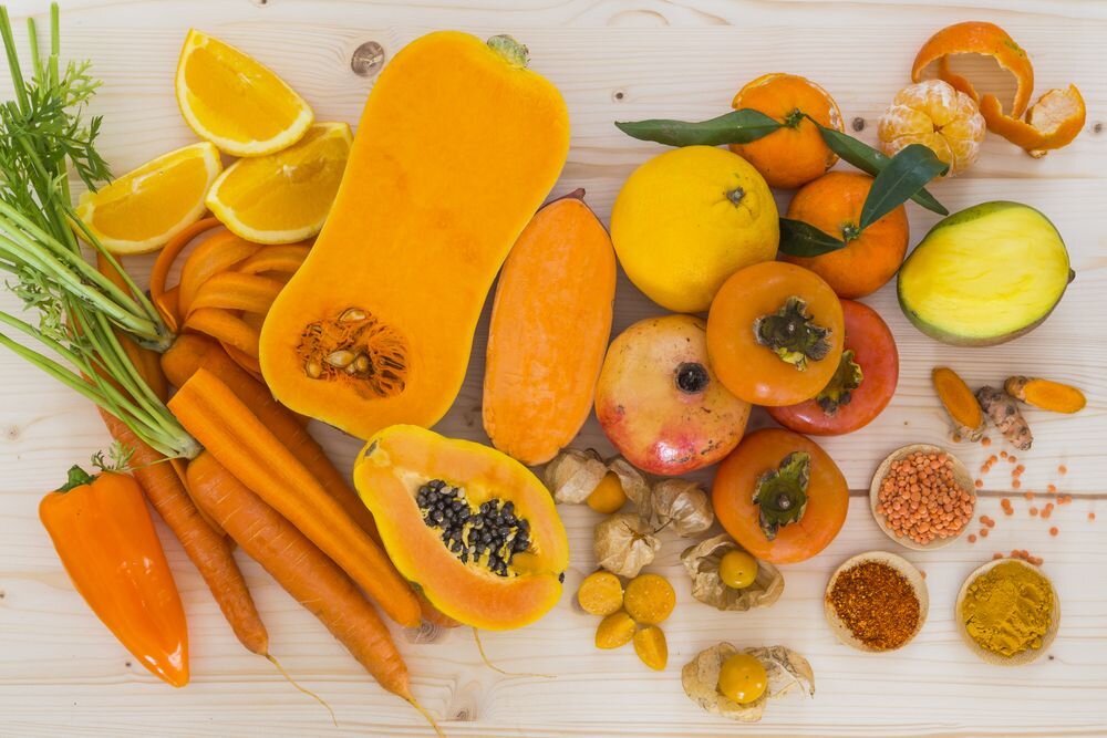
Eat your fruit and veg!
There is evidence that humans are sensitive to the subtle connection between yellow and health.
No matter what your ethnicity, there are yellow pigments in our skin called carotenoids.
These are the same pigments that colour fruit and vegetables such as pumpkin, corn, carrots, canteloupe, mangoes, capsicums and citrus.
Carotenoids have been associated with immune defence, antioxidants, cognitive health and photoprotection.
Eating carotenoid rich foods gives an attractive quality to our complexion and people with a balanced amount of carotenoids in their skin are perceived as healthier.
Wearing our best yellow connects strongly with these pigments which is why it makes us look so vibrant and well.
It’s repeating the skin’s healthy tones.
Just don’t eat kilos of carrots or you might turn orange!
Conversely, other kinds of yellowness in the skin is undesirable and implies sickness or conditions like liver malfunction.
When we wear versions of yellow that aren’t quite right for us, the colour connects in an unhealthy way with our face and can give the illusion of these illnesses.
If you’ve never seen yourself in your best yellows, you may think all versions deliver this unpleasant result.
And as we will see shortly, that’s definitely not the case.
We notice when someone is wearing yellow.
Because of it’s visibility, under-application in styling, and almost certainly our own trepidation, yellow becomes a bit of an event.
Sure, it trends occasionally but on the whole, you don’t see a lot of yellow every day.
If you do, I bet it was more memorable than the thousand people wearing blue or black!
The possibility of standing out makes people jittery.
It’s not that other colours outside our best palette don’t also create less-than-flattering results - they do! - it’s just that we aren’t paying the same attention.
Consequently, if we don’t know how to find our best yellow, we might just feel it’s all too risky and avoid it entirely.
Once down that path, we become so unfamiliar with seeing ourselves in yellow that we lose the ability to understand the colour.
The experience of yellow can become uncomfortable, even if the version is perfect.
Many of my clients struggle to acknowledge the superb effect of their best yellow even when draped in controlled conditions.
The prospect of yellow as truly flattering is challenging for a lot of people.

Cool yellow exists.
Resist your intuition that all yellows are sunny, golden or warm.
Mustard for Autumn and buttercup for Spring seem intuitive.
But purely cool and cool-neutral palettes also contain yellow.
Pastels belong with Summer while Winter’s bold yellows are sulphuric or icy.
Cool toned people have the marvellous ability to neutralise these yellows, make them perfectly normal and deeply flattering.
I don’t want to stand out like a canary.
That colour wouldn’t suit anyone.
Yellow completely washes me out.
It makes me look jaundiced.
I’m not into making a statement.
I don’t have the right skin tone.
These are all real objections I’ve heard in my line of work.
But guess what?
#NotAllYellow.
I guarantee there are yellows for everyone.
Knowing your palette means you can start exploring them with confidence.
When matched with the right version of this colour, a special kind of magic happens.
Yellow brings contrast, lift and energy to an outfit.
It makes for great design!
Instead of viewing yellow as an adversary, think about how fresh and playful it can be, how cozy, elegant or edgy.
These qualities can translate into your styling.


What does good look like?
If you’ve never really thought about yellow looking awesome, you might need some examples of people showing us how it’s done.
It can be tricky finding pictures where absolutely everything is on-palette so please overlook the occasional lipstick grievance or distracting accessory.
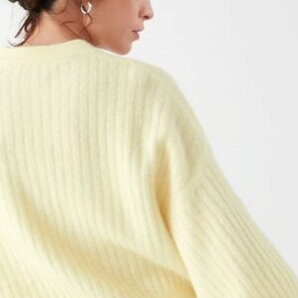
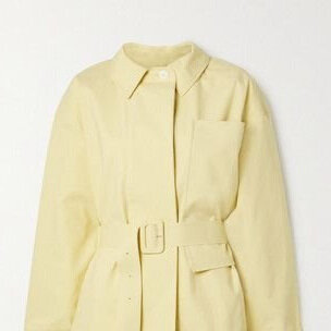
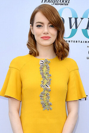
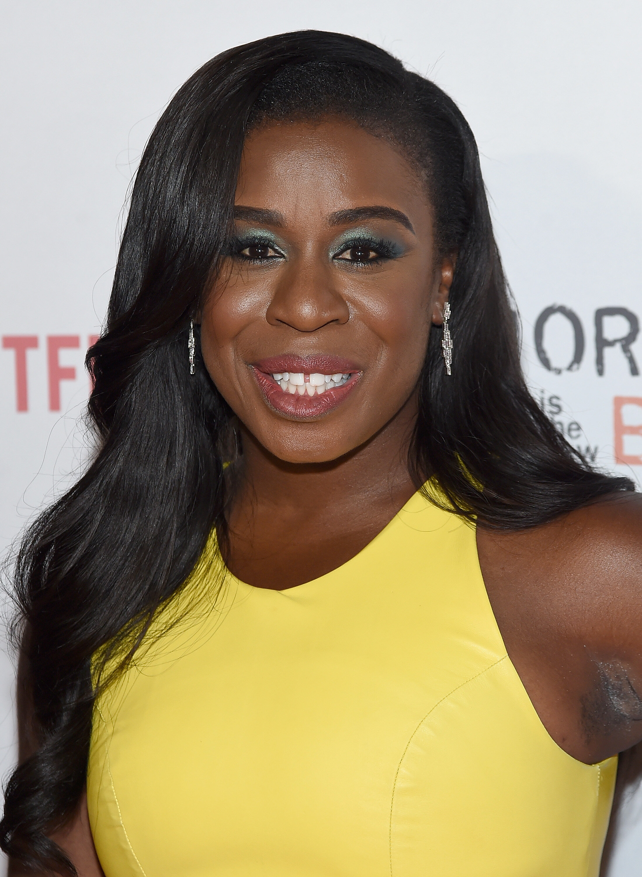
Bright Spring
Sunflower, taxicab, marigold, imperial yellow


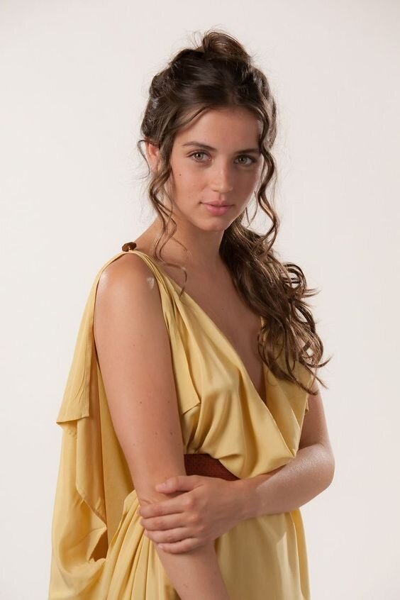
True Spring
Mango, daffodil, maize, pineapple, buttercup, dandelion, passionfruit


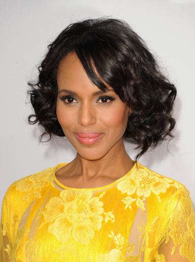
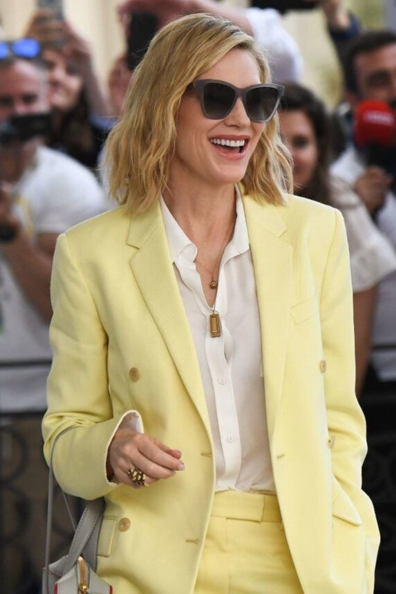
Light Spring
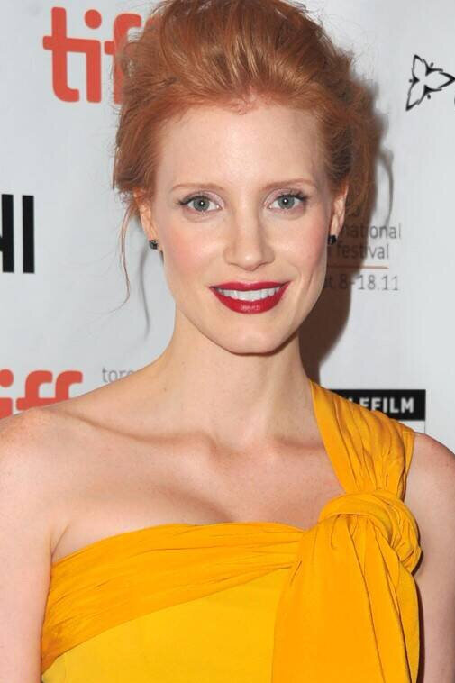
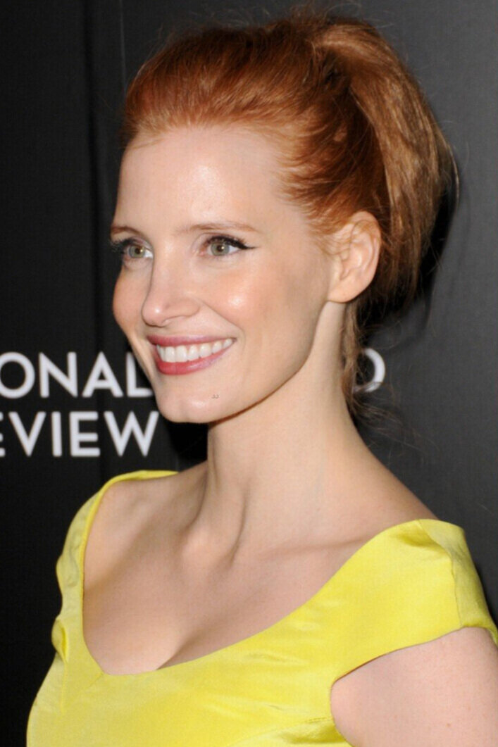
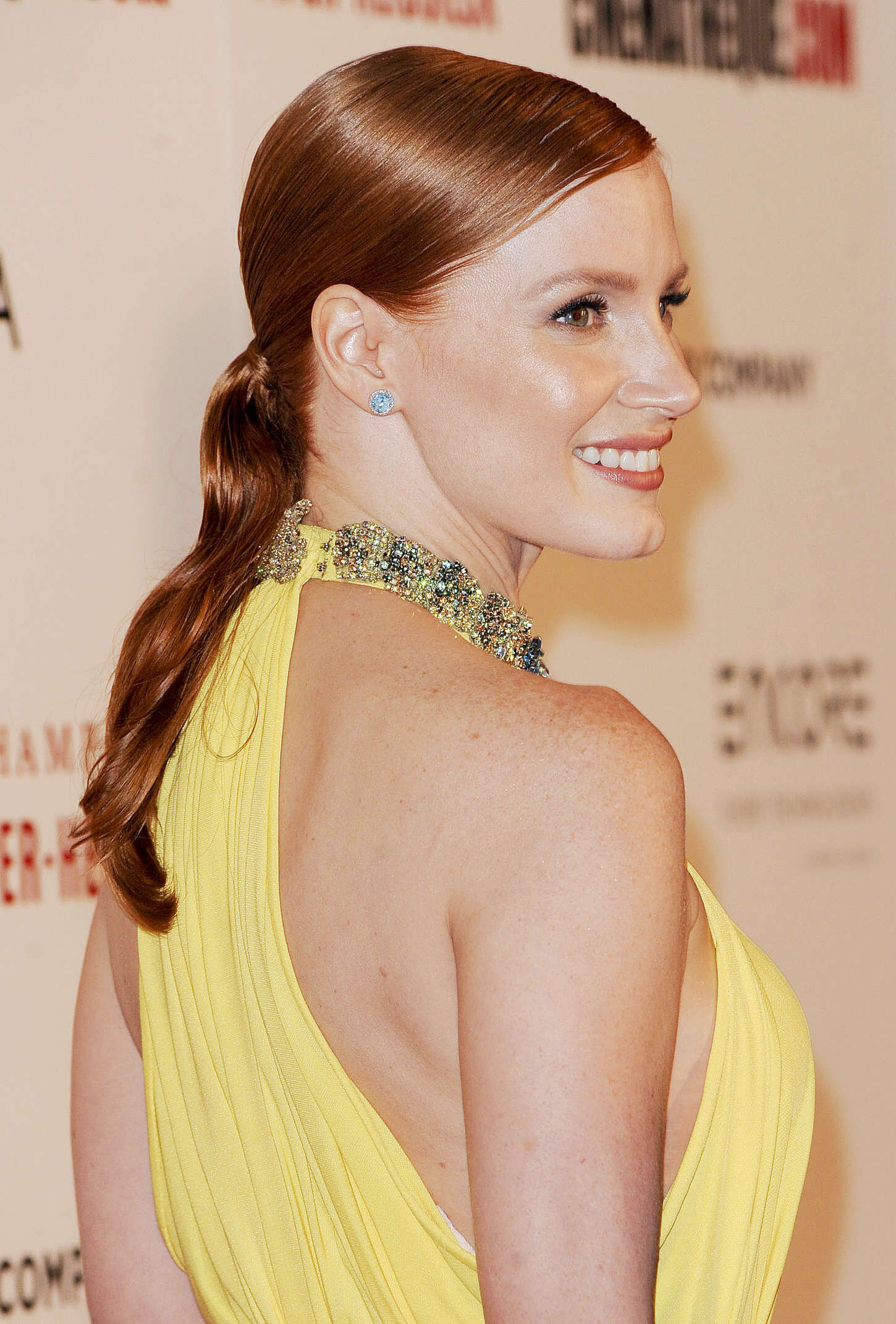
Jessica Chastain is not afraid of yellow.
She wears it a lot which is a good thing because all Springs come alive in their many versions of this colour.
But these aren’t among Jessica’s best examples.
The first yellow from Bright Spring is too high in chroma, the second from Winter too cool and acidic.
The third is from the Light Summer palette and it’s pretty close but as a season, Light Spring is brighter, lighter and warmer.
Jess is almost getting away with that one but we want ultimate results!
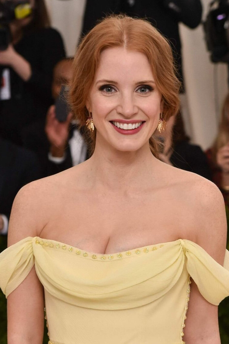
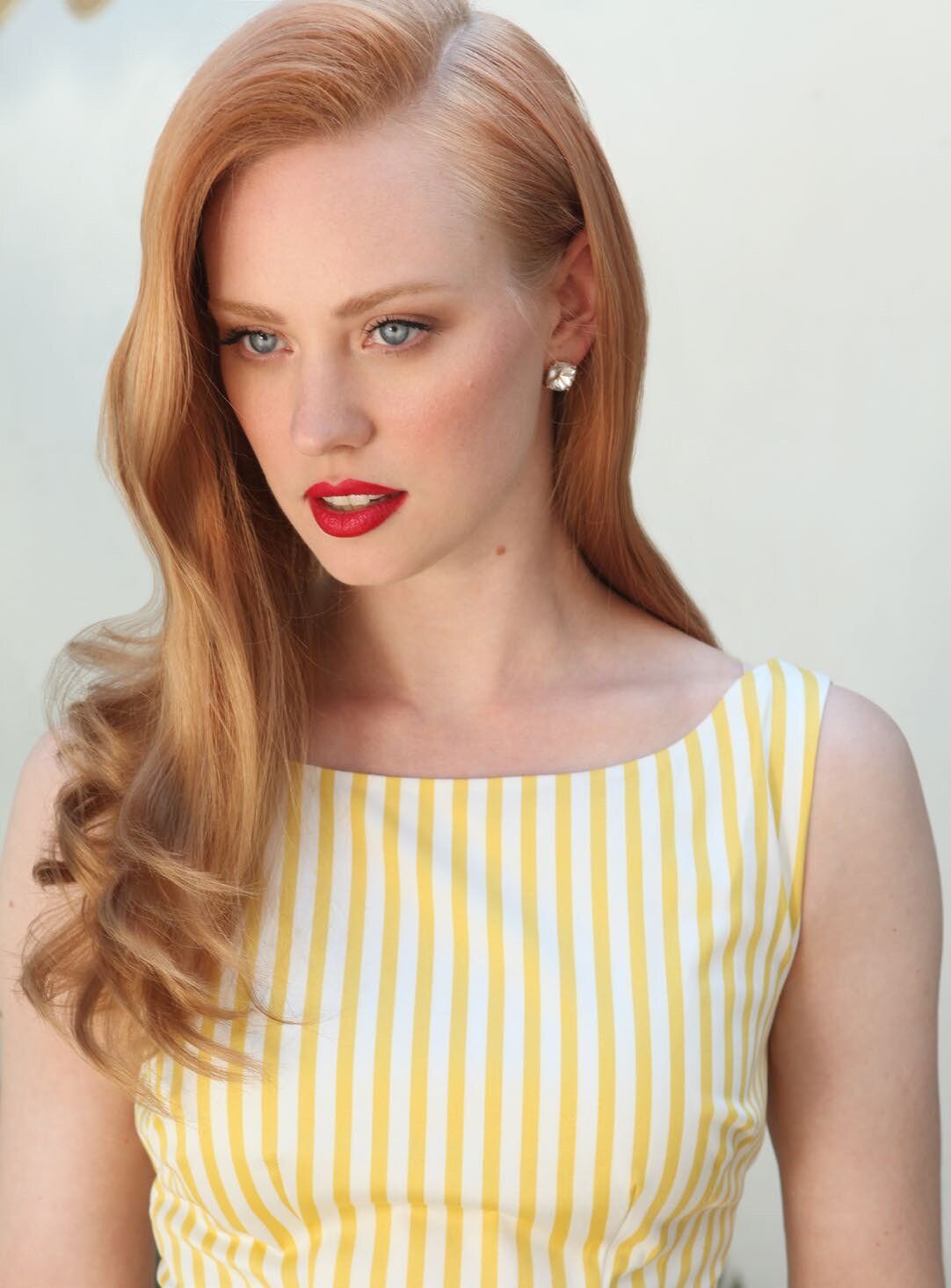
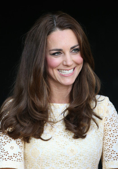
And there you have it.
Ultimate results.
That’s Light Spring yellow once, twice, three times.
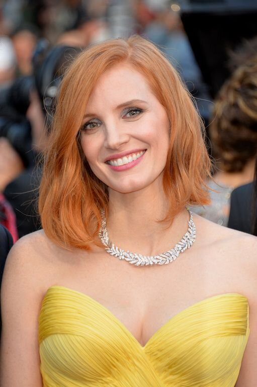

And here are a few more Light Springs owning their amazing primrose yellows.

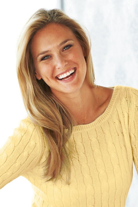
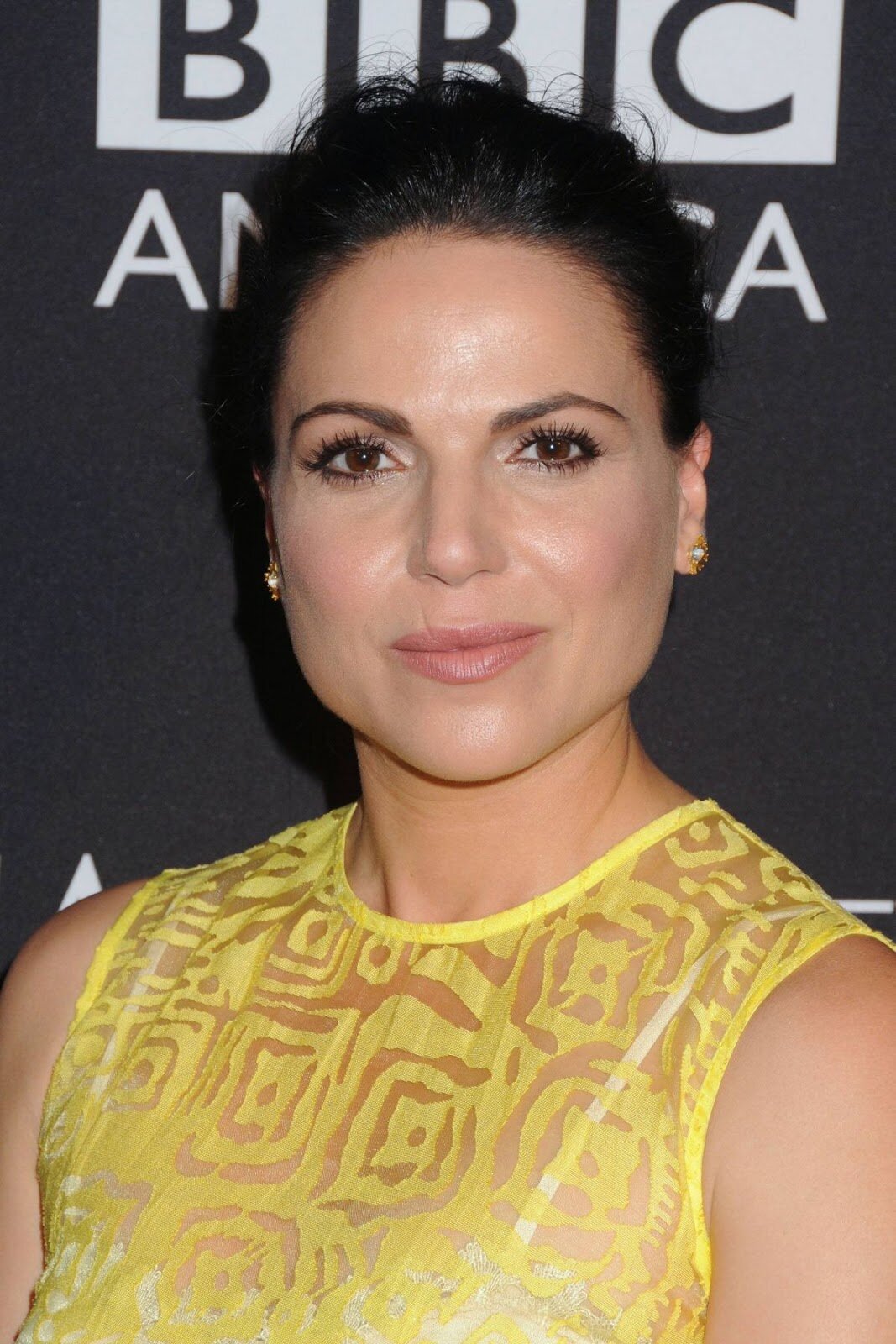
Light Summer
Lemon butter, mango lassi, vanilla custard


True Summer
Lemon sorbet, citronella rose, lemon chiffon

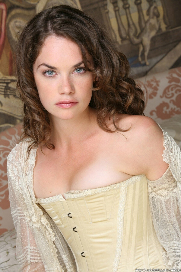
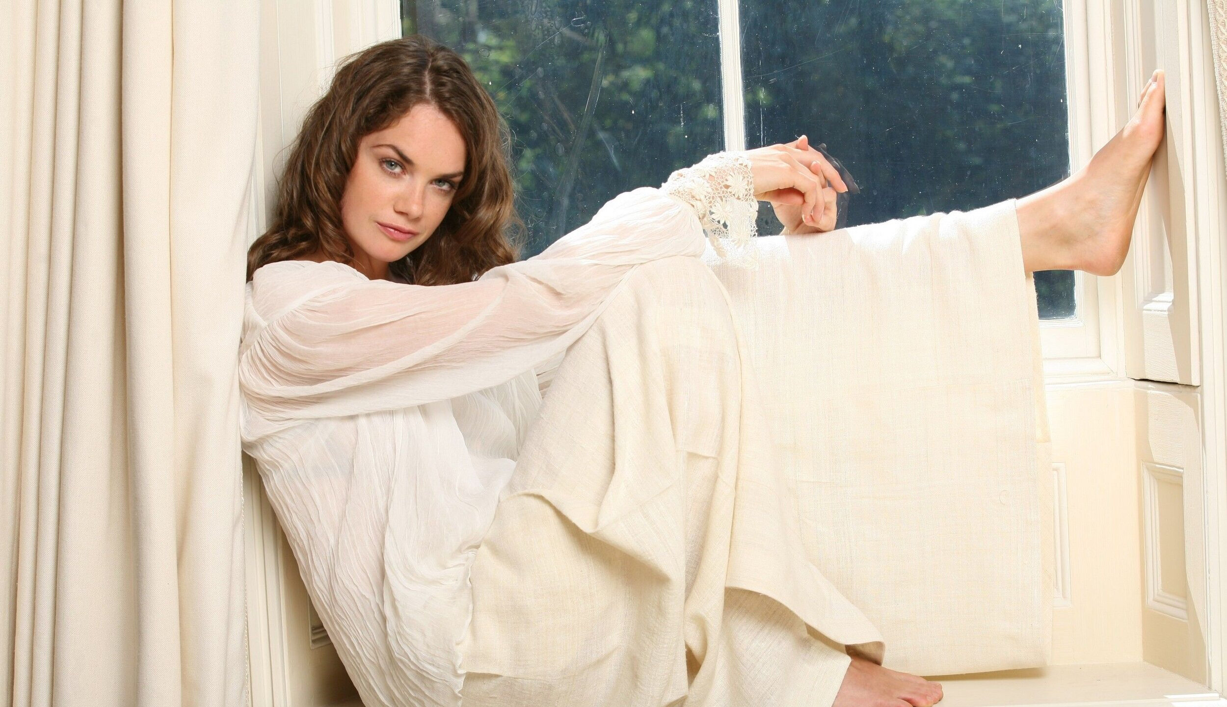
Soft Summer
Consider Ruth Wilson in sunny orange-yellow from Spring, tawny brown-yellow from Autumn and bright green-yellow from Winter.

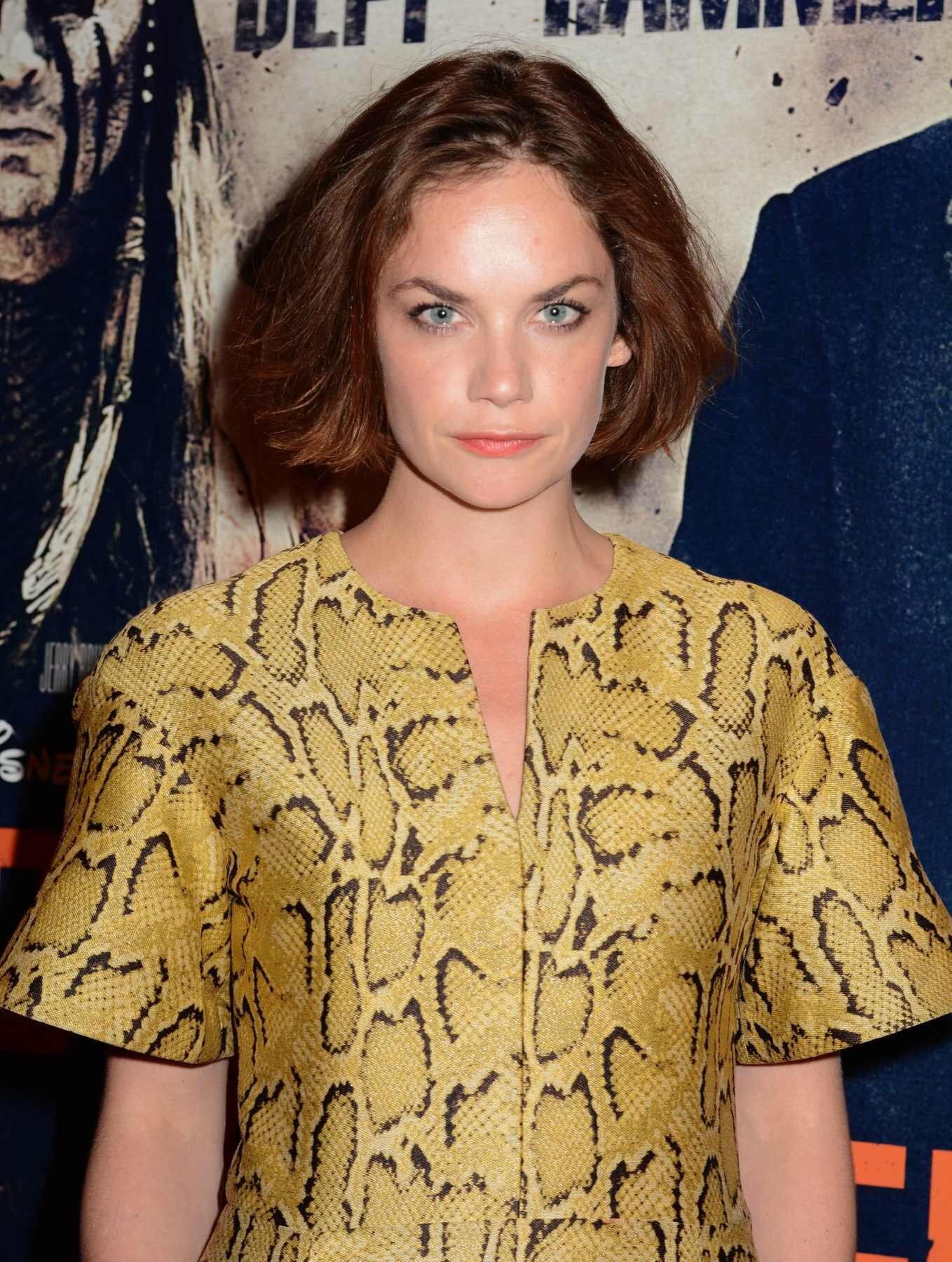
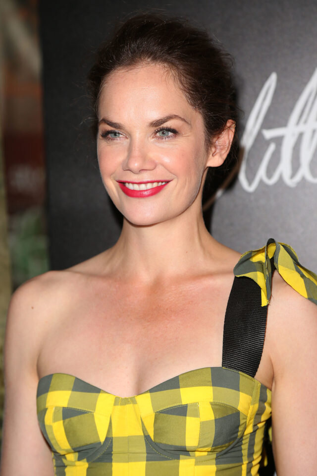
Now compare them against clouded, antique lemonade.
Which best showcases Ruth’s natural beauty?
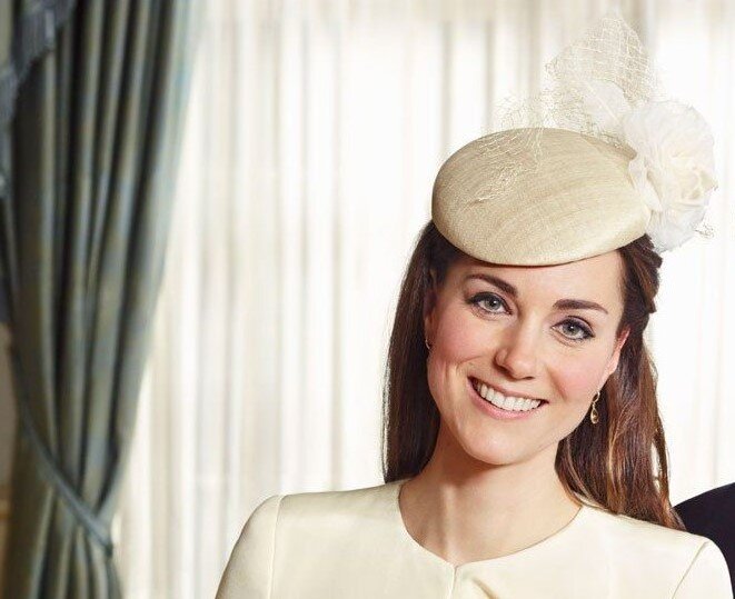
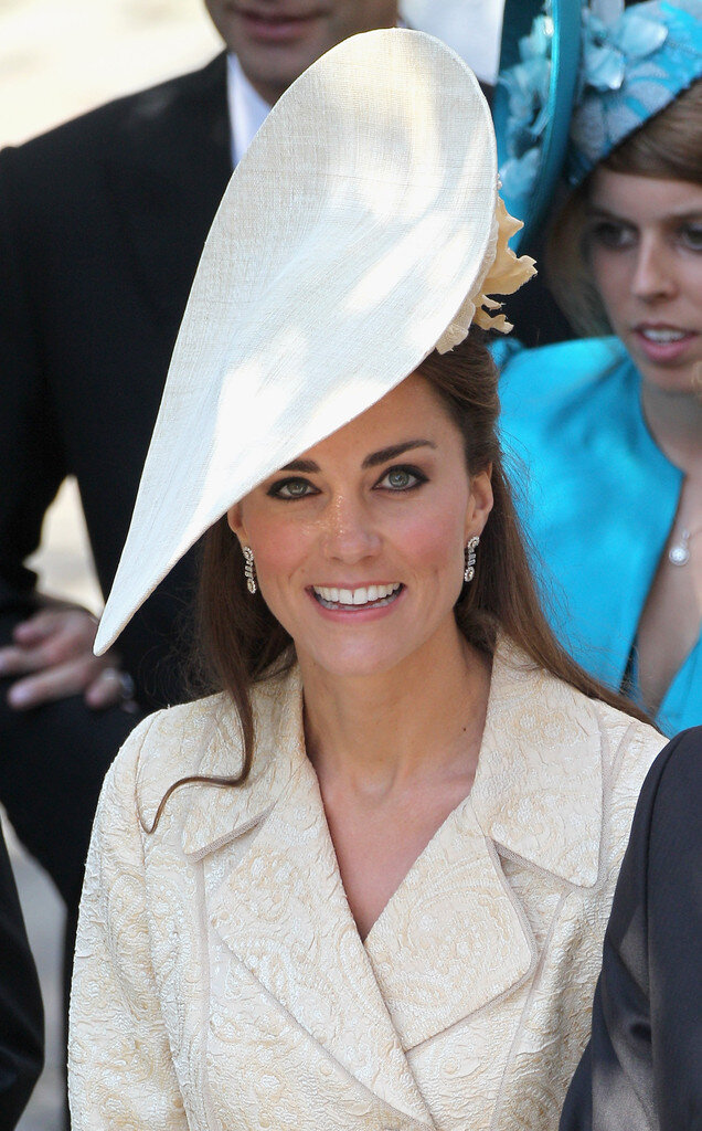
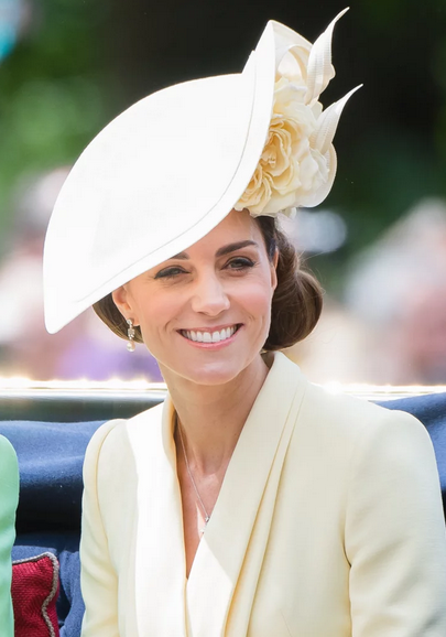
And here’s Kate Middleton, aka Princess Kate, aka the Duchess of Cambridge, repeatedly showcasing Soft Summer’s filtered, slightly dirty pastel yellows.

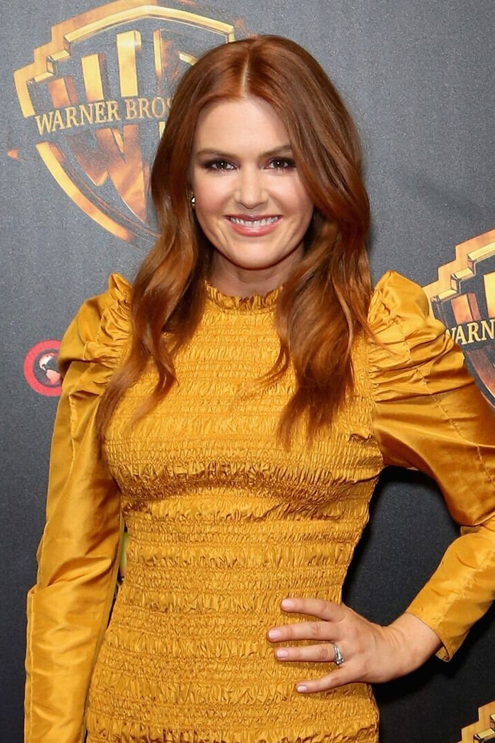
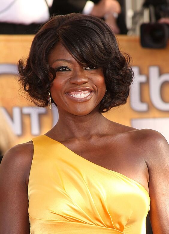
Soft Autumn
Harvest gold, yellowed tan, flax, straw

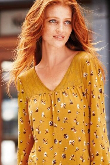
True Autumn
Mustard, butterscotch, dijon, amber, yellow ochre, honey
Dark Autumn
Below Freida Pinto is trying on a couple of Winter yellows that are way to bright and cool.
As for that earthy gold, it’s in the ballpark but doesn’t match Freida’s depth so looks a bit lightweight and flat for a Dark Autumn.


Just wow.
Turmeric and tarnished gold on the other hand, are sensational for this season.


And now for a few more Dark Autumns rocking spicy saffron and goldenrod.


Dark Winter
Icterine, goldfinch, lead tin yellow
True Winter
Aureolin, sulphur, cadmium yellow


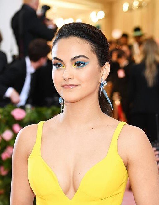
Bright Winter
Here Olivia Munn road tests Autumn and Spring yellows.
They’re all miles too warm, among other conflicting factors mostly in the makeup department.
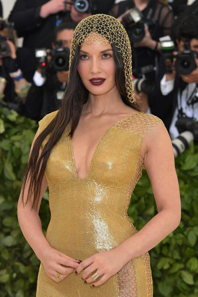

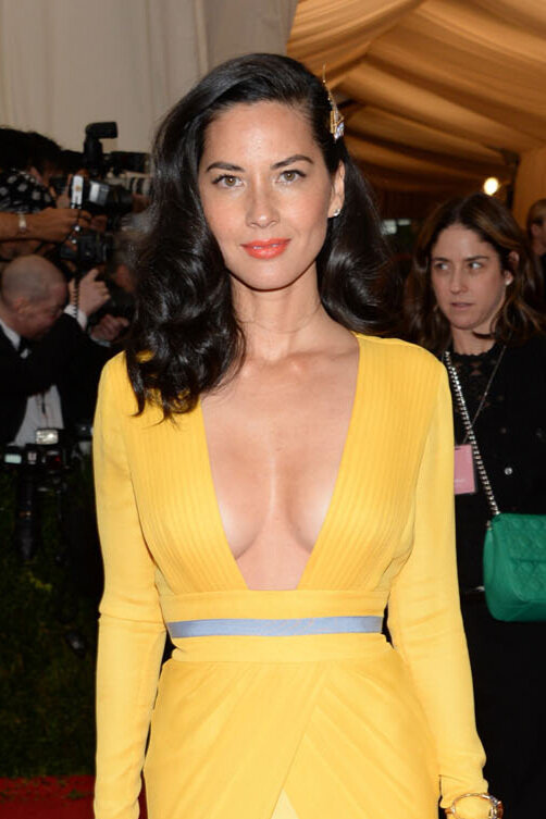
But hey, this is the season of brilliant, superhuman yellow!
Even almost-fluoro chartreuse doesn’t distract from the most important focus - Olivia’s face.
When colours are working, it’s easy to maintain eye contact without the outfit competing for attention.


Bonus Bright Winters show that yep, some people really can wear that colour!
Canola, titanium yellow, canary, wattle, chartreuse, acid yellow


Still unsure how to step into the yellow light?
Thoroughly learn your seasonal yellow’s hue, value and chroma.
Find places where it appears in the real world to use as a mental reference point.
Introduce yellow into your outfits with accents, prints or accessories and observe how it connects with other colours in your wardrobe.
When shopping, step outside your comfort zone and try on yellow without the pressure to buy.
All of this helps familiarise you with how yellow looks and feels.
And at the end of the day, if you don’t like yellow, that’s ok!
Just because a colour suits you, doesn’t mean you have to wear it.
Keep in mind however that this is a personal preference, not a fault with the colour :)

My parting advice:
Reframe your relationship to yellow.
Yes it might feel weird at first and it takes a little practice to train your colour eye.
But the results are worth it.
Using yellow well brings an advanced level of polish to your wardrobe.
Yellow is striking when the colour’s visibility is used to advantage and its under-utilisation in fashion gives unique and unexpected results.
So do away with your fears.
Making friends with yellow is fun!
When done right, yellow is quite the miracle.
