

Bright Spring colour breakdown
/Today we turn the microscope to Bright Spring.
What can we learn by deep diving into the structure of this palette?
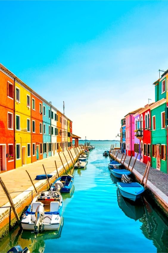
Here is a slice of Bright Spring:
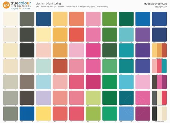
It’s easy to get discombobulated in all those vibrant little squares, isn’t it?
Colours can seem kind of abstract in this form.
Let’s isolate some colours - or groups of colours - from this palette to learn more about the Tone’s distinctive features.
Welcome to the heart of Bright Spring.
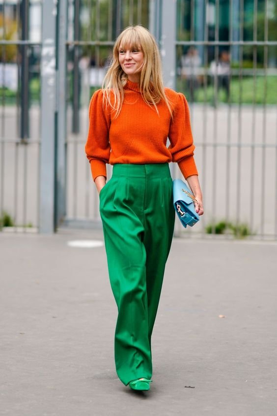
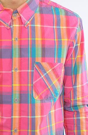
Accents
Here’s your very own colour wheel of selected Bright Spring accents:

Bloody gorgeous.
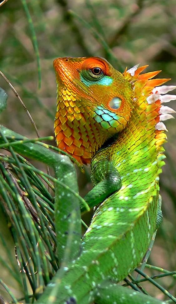
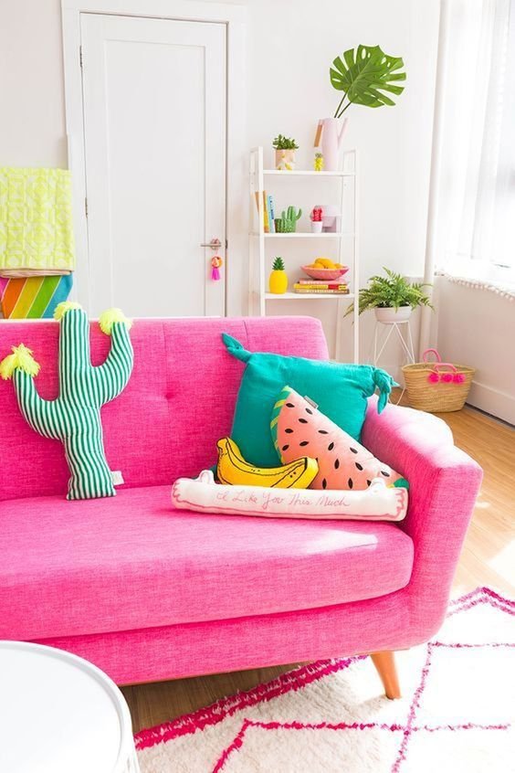
What a spirited, festive palette!
Lots of energy, quite playful and fun.
Plenty of light, plenty of brilliance.
And a little bit of edge.

Neutrals
Bright Spring neutrals are quite unusual and tend to be pretty new to people.
Learning where these neutrals sit in colour space can be helpful in understanding them.
Which means they are easier to spot!
Bright Spring is predominantly warm so the neutrals are influenced by yellow and green.
Here are Bright Spring’s yellow neutrals:


This wheel moves from the lightest radiant cream or white chocolate, through a series of vivid sandy beiges, into browned taupe and black.
I think the yellow base is fairly noticeable at the lighter end of this range.
But remember that brown is a darker version of some other colour, it’s not exactly a colour in it’s own right.
For warm seasons, brown is usually a form of darker yellow or orange.
And although you probably can’t see this at face value, that second last colour just before black is actually quite surprising.
This colour’s print Hex code is 312a27.
Look at where 312a27 falls in colour space:

Dark orange!
This colour’s deceptively concealed orange undercurrent is no match for Microsoft Paint 3D.
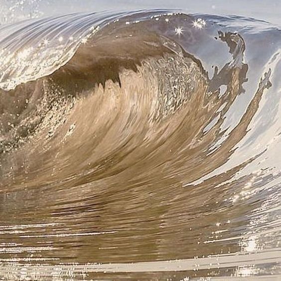
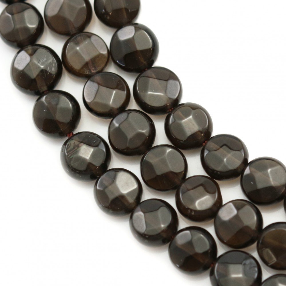
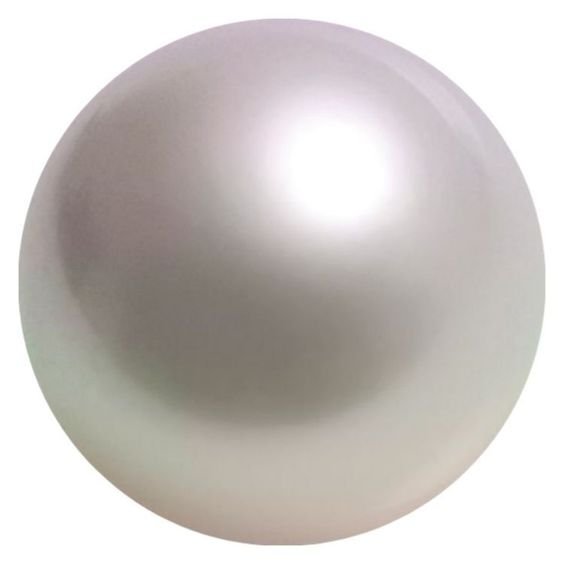
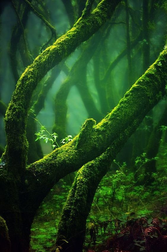
A great reference point for Bright Spring’s darkest browns is shiny or faceted cut smoky quartz.
Looks pretty dark on a Bright Spring but not super dark in the grand scheme of things.


Now to Bright Spring’s green neutrals:
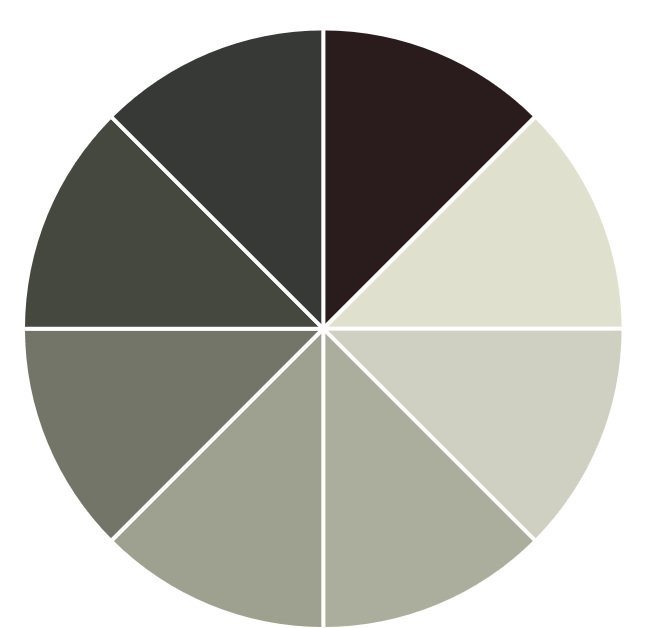

This is where Bright Spring grey comes into its own.
Think of Dark Autumn’s dense rhino hide greys but add a ton of light.
The result? Oyster grey.
These colours tend to look grey in the presence of the rest of the palette but you can really see their greened base when separated out.
The lighter end of this range sits in the grey space on the edge of yellow and green.
Colours turn greener as we dial down the value until we again finish with black.
Not sure what I mean?
Yellow struggles to go dark so it either turns brown (like the example above) or green steps in.
The lightest colour here is Hex code dfe0ce which is more yellowish…

…and the second darkest before black is 373936 which is more greenish:

Some of these greys might look quite similar to those found in other Tones.
Grey is one of the most complex of all colours and definitely the trickiest to pin down because it’s just so super neutral.
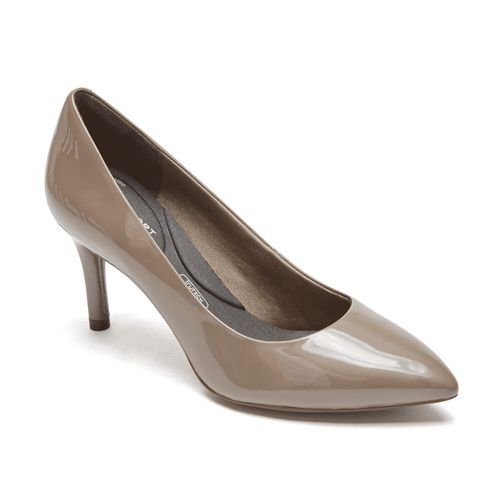
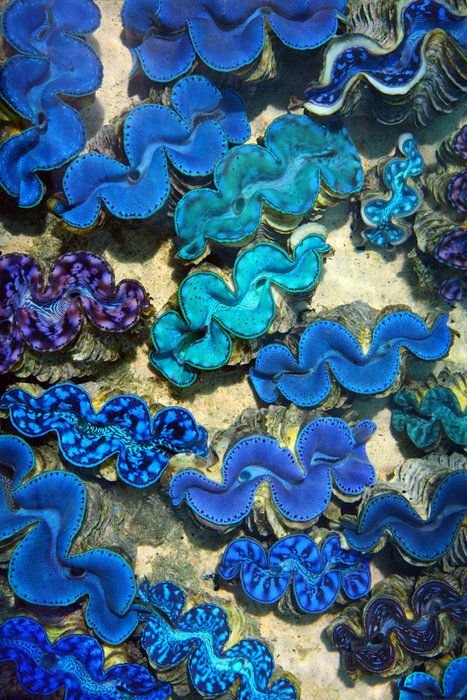
It’s not necessary but smooth, slightly reflective or luminous materials can do a lot of heavy lifting for Bright Spring.
Think patent leather, silk or satin, the parachute fabric used in lots of sportswear.
These materials can make apparel appear more lightweight and convince our brain there’s a lot of light bouncing around, rather than being absorbed.
This effect can sometimes help push a warm grey into balancing more easily with the rest of the palette.


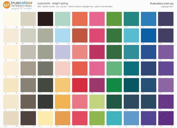
Darks
Here’s a selection lifted from the classic and corporate palettes:

Look carefully at the themes here.
Unsurprisingly for a warm Tone, green is really influential.
It appears in the teals right through to the khaki-brown.
Note that none of these neutrals are actually particularly dark.
At least not as far as colour space stretches.
Look at black.
Now that is dark.
The black wedge looks like a void in the company of these other colours.
Let’s remind ourselves that the reason black appears in the Bright Spring palette is its chroma rather than its value.
This is why black is a useful working neutral in the palette, rather than a perfect standalone colour.
It’s handy in styling and plays a role in the Bright Spring wardrobe.
But any one of those other darks would read as much more interesting and alive on a Bright Spring.

What else can we derive from studying Bright Spring darks?
These colours don’t necessarily present as particularly high chroma when clustered like this in a group.
But they actually are.
Other Tones go waaaaay darker.
Bright Spring darks really come to life when teamed with something from the more “colourful” mid to light section of the palette.
Because remember, Bright Spring is a medium - high value season.
This Tone only touches the dark with its fingertips; it definitely isn’t at home there.
Wearing colourful darks all over can seem a bit flat because Bright Spring needs lift.
Adding even a small accessory in one of the lighter colours remedies the situation instantly.
Lights
Speaking of lift, here are Bright Spring lights:

This mood is so elegant and dynamic.
The glassy-yet-punchy colours of the dawn.
Heavenly.


Thank you Bright Spring for bestowing us with your astonishing beauty.
Long live Bright Spring!
