

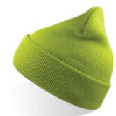
True Spring Yellow-Green
/Today we are meeting True Spring’s lively yellow-greens.
This is a collection of transitional colours, closer to the border with yellow than other greens from the same season.
This place in the palette has a very particular essence.
Most True Spring greens are lush like abundant foliage, or mixed with warm purple-blues to create lagoon turquoises.
But True Spring yellow-greens are sunlight transformed into life.
These are newer-looking greens, like shoots that have made it past those first exquisitely fragile stages of growth and are now thriving.
A baby fern frond unfurling.
A head of young cos lettuce.
Think of the sharp, sweet, glorious scent of cut grass and you’ve captured the spirit.

True Spring yellow-green is very special.
It often signals ripeness in fruit and health in plants.
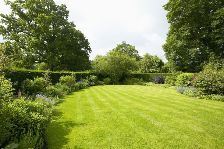
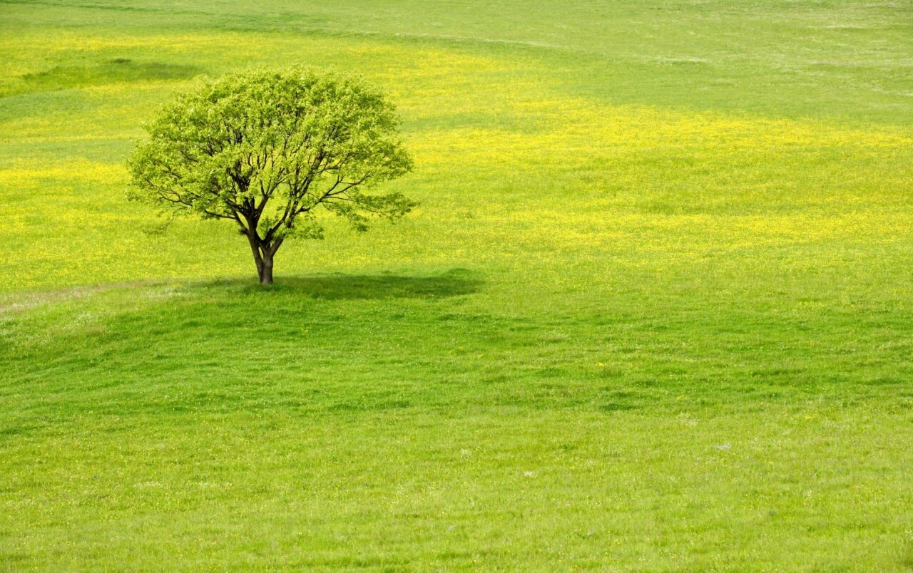
When we see it to scale in the landscape, this colour’s meadowy personality suggests a benevolent place.
Fertile soil, rain, sunshine, a bountiful time of year - and plenty to eat.
The colour’s purely warm base banishes all allusion of barren winter months with lean pickings.
And because of our evolutionary heritage, our human brains love all this stuff.
At an elemental level, we recognise this colour’s message.
Health and nourishment.


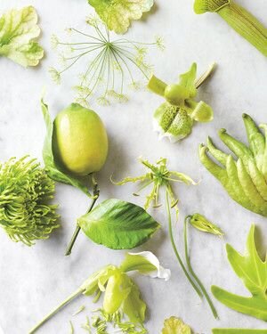
Where can you spot True Spring yellow-green in the natural world?
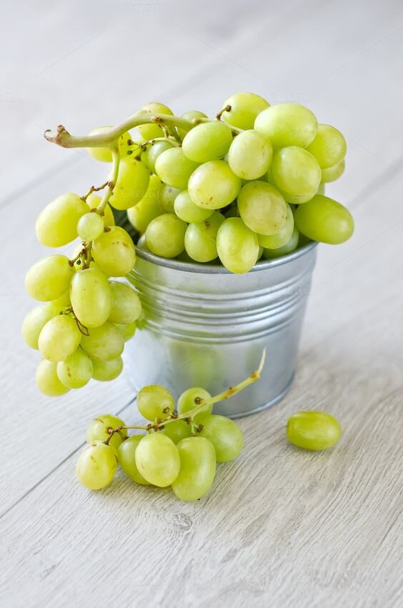
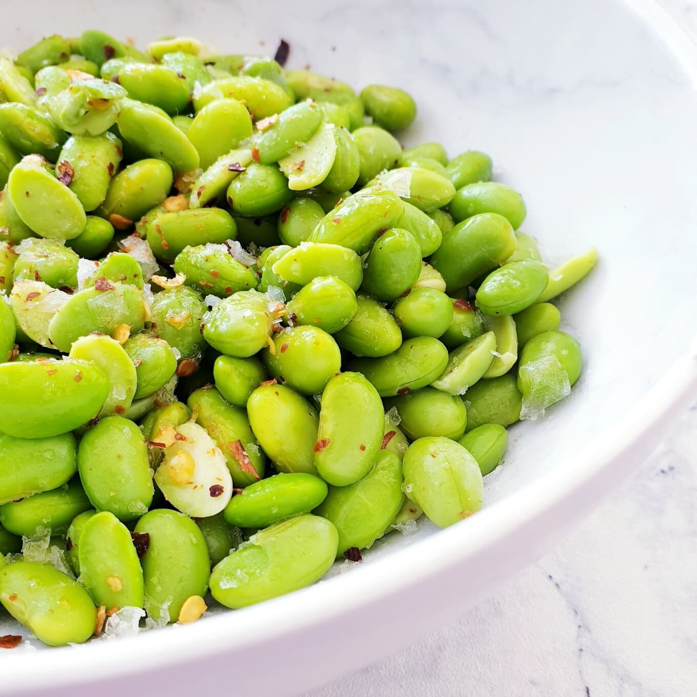
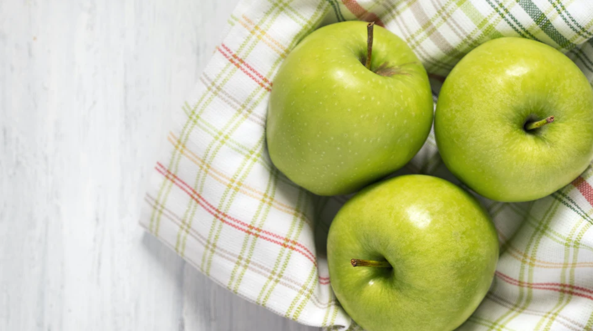
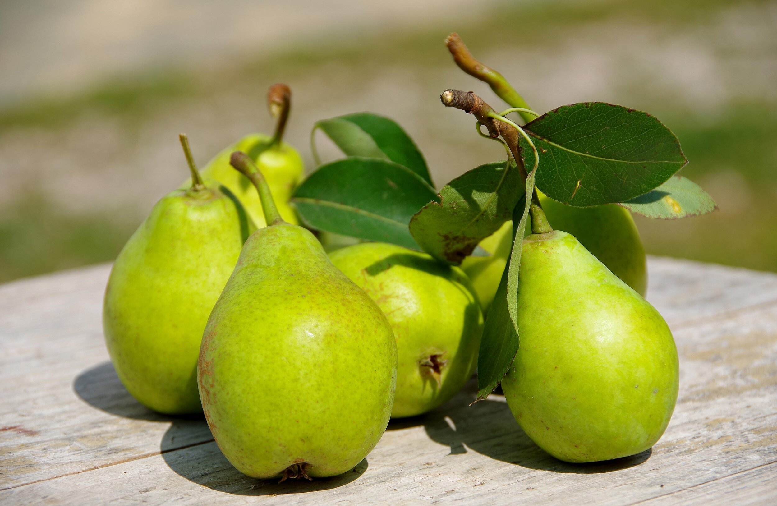
Start with fruit - think granny smith apple, tosca pear, edamame and green grapes.
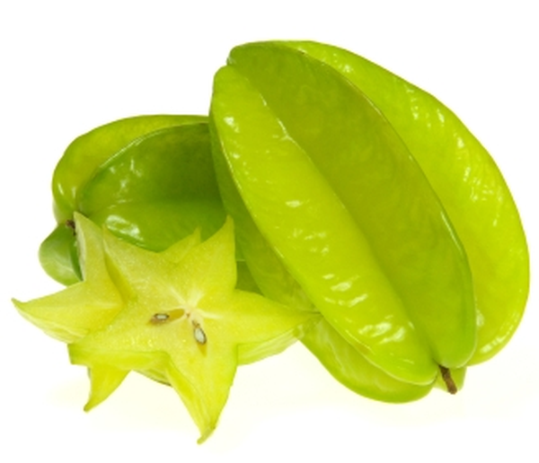
Ripening citrus or carambola.
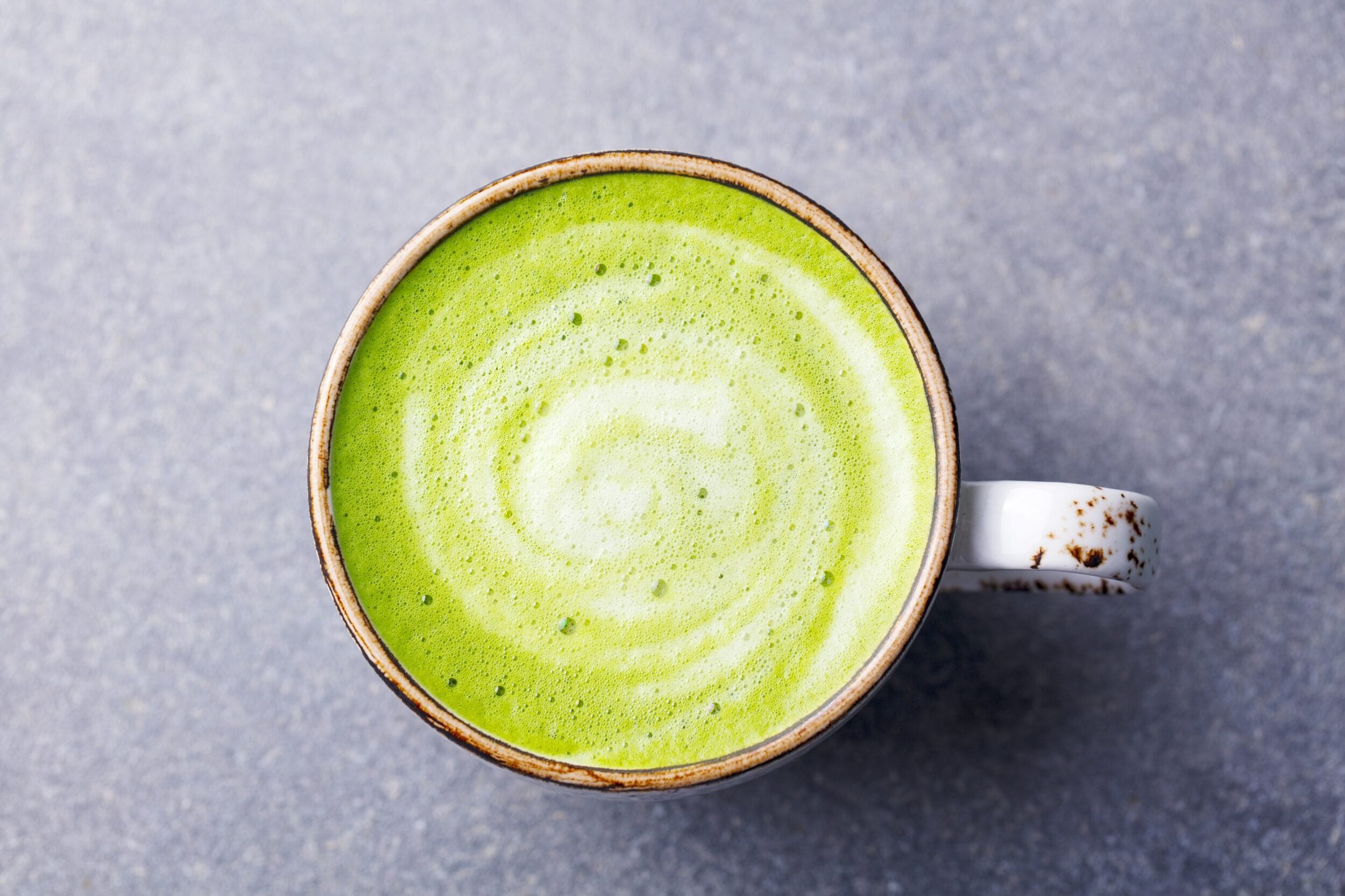
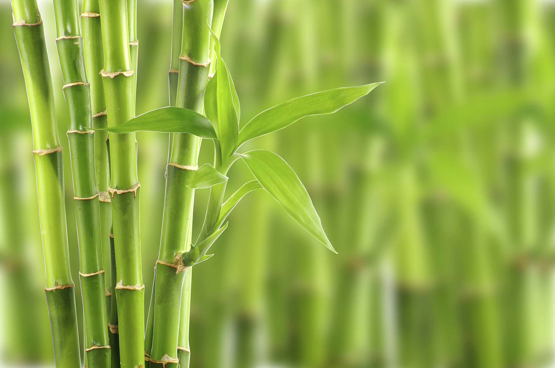
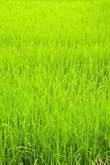
Don’t forget that leafy quality too, reminiscent of mown lawn, bamboo and macha tea.

An amazing characteristic of this colour is we can almost taste it.
The yellow tones communicate fresh, crunchy, snappy and crisp.
This colour might not be quite as sweet and luscious as others from the palette but it’s equally alive.
There’s a delicious hint of tartness here, a grassy or hoppy flavour, plenty of zest.
Ah, it feels good just looking at it!
How does our feature colour stack up against similar-looking neighbours?
A lot yellower than its Spring sisters.
This is because Bright and Light Spring are cooler so their yellow-greens fall further from the warmest part of the colour wheel than True Spring’s.
And a lot lighter than its True Autumn cousin.
True Autumn colours are dense, mature and of the harvest.
They imply a later stage in the lifecycle, not the beginning of it.
Bright Spring contains punchy, high-chroma yellow-greens like parakeet, young rice and chartreuse.
Light Spring’s versions are extremely delicate - the very first tender bud of spring - with a dewy, transparent quality closer to elm blossom, gooseberry or honeydew melon.
And the value contrast between True Spring avocado and True Autumn’s equally warm but much richer golden-olive is quite apparent.
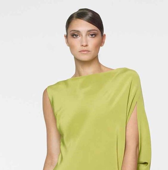
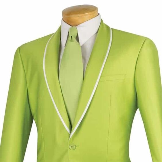
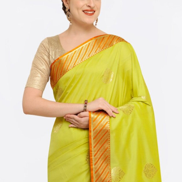
True Spring yellow-greens are an interesting styling choice, in no small part because only True Springs can wear them well.
They often throw an odd yellowish cast on the face.
The result is unlike other discordant colours which may wash out or overwhelm but not always look objectively unpleasant.
This isn’t a healthy “golden glow”, it’s an undesirable optical illusion, and only True Springs are spared.
In fact, True Springs positively sparkle in this colour - skin becomes clean and even, with a youthful peachy or creamy finish.
It’s no mean feat.
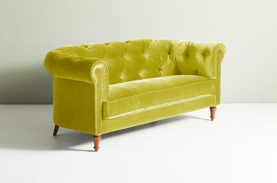
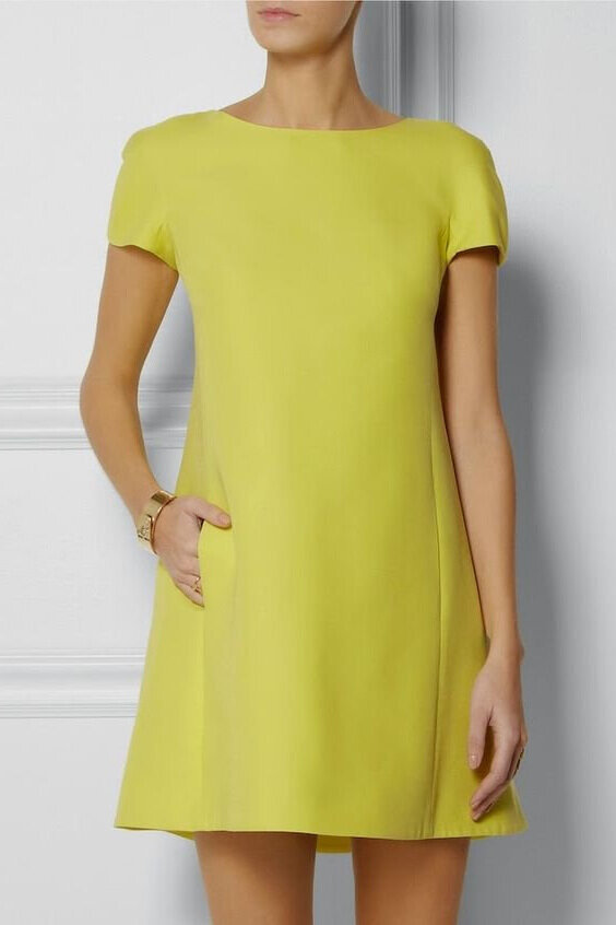
True Spring yellow-greens are great feature colours.
They can be layered with other greens, grounded with nutty brown or offset with coral and orange.
A pop of yellow-green makes an unexpected accent in a True Spring outfit.
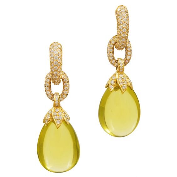
Look for yellow-green versions of peridot or chrysoberyl set in shiny gold.
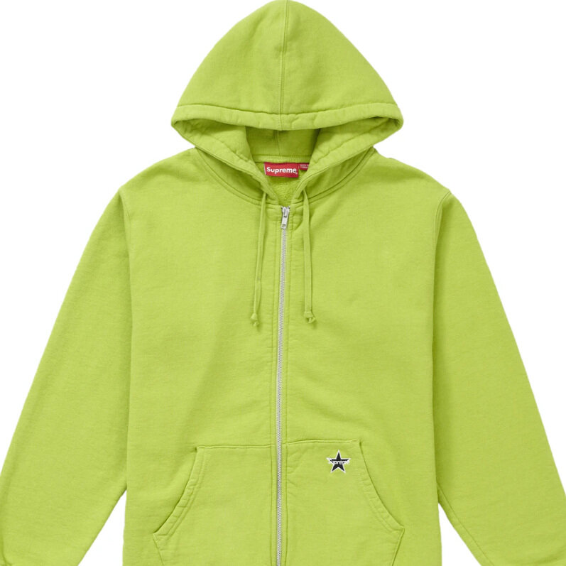
Incorporate into a cool-weather wardrobe for an uplifting change from everyone else’s predictable winter neutrals.


One of the things I love about under-used colours is that they instantly become edgy and daring the second most people shy away from them.
Conversely, the very same colour transforms when worn the by the right person, becoming totally balanced and kind of normal.
Then we wonder why we thought it was so intimidating in the first place!
Case in point:
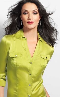
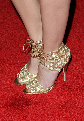
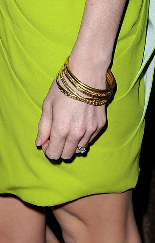
Look how Jayma Mays is nailing this True Spring yellow-green.
She’s cleverly teamed it with all-over gold jewellery and shoes, a shiny light-bronze clutch and luminous, peachy makeup.
Sure, we might note the slightly unusual colour of the dress.
But our attention is ultimately held by Jayma’s eyes - always the end goal in colour harmony.
I notice this phenomenon particularly with the head shot - it’s like the vibrant green is framing Jayma’s face, repeating her True Spring beauty.
There’s no tension here, no competition between Jayma and her outfit.
(I also love that Jayma maintains hair close to her natural colour, it’s rare to see an unadulterated True Spring.)
She looks modern, interesting and totally animated.
For Jayma this colour isn’t a brave choice, it’s a sensible avenue to looking outrageously fabulous.
Jayma’s styling is glamorous for sure, but it’s something else as well.
The result is so effortless, like all these pieces were destined to be together.
Natural beauty and colour harmony create magic.


Just to labour the point, here’s Jayma again, this time in True Autumn yellow-green and Autumny makeup.

Jayma can balance the heat but not the softness and definitely not the darkness.
Something is working at a stretch, and the styling is professionally executed, but the fresh Spring vibrancy is crushed.
The result is drab and heavy.
Bring back Jayma’s radiance!
I am particularly fond of this colour and what it represents.
It’s just so peppy and evocative.
When used well, I feel my spirits lift with its green goddess energy.
Viva True Spring yellow-green!