

Spotlight on Value Contrast
/In the world of colour we are always talking about hue, chroma and value.
These are the three building blocks or dimensions of colour.
They are foundational principles and colour skills cannot develop without at least nominally understanding them.
However, there’s another powerful aspect of colour theory.
The role of contrast.
Contrast is not actually a dimension of colour in the same way as hue, chroma and value.
It’s an important related concept.

There are a range of definitions and interpretations of contrast for different purposes.
In the context of interior design, a lush velvet sofa in a sleek modern room could reference contrast in texture and form.
Varying fonts create size and spacial contrast on a graphic poster.
Photographers follow several key principles on the subject.
Contrast seems to be lots of different things.
What role is it performing?

Essentially, contrast breaks things up.
It adds some kind of variety or visual interest.
When everything is very samey our brain isn’t particularly stimulated and we might find the result flat or boring.
In the world of Personal Colour Analysis, we work with two kinds of contrast.
Value contrast and colour contrast.
Today I’m going to talk about value contrast.
Any season can use value contrast to inject interest and depth to their style.
Anyone can wear light and dark together in a way that creates contrast in an outfit.
However value contrast expresses itself a little differently depending on the palette.
So to use it really effectively, a tailored approach is best.
Unpacking value contrast
If you’ve worked with art or design before you may understand value contrast as “tonal contrast”.
They are essentially the same concept.
We can frame value contrast as the difference, or space, between two colours.
(Remember, value denotes the lightness/ darkness scale.)
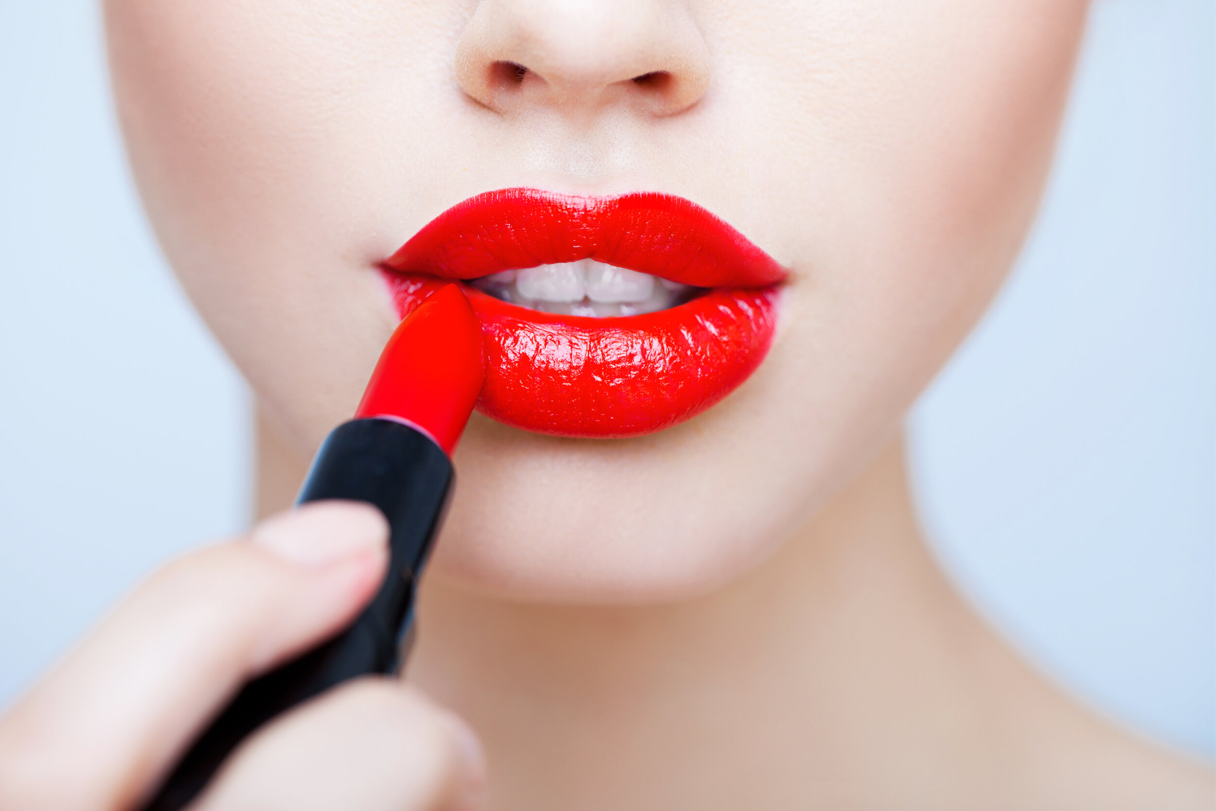
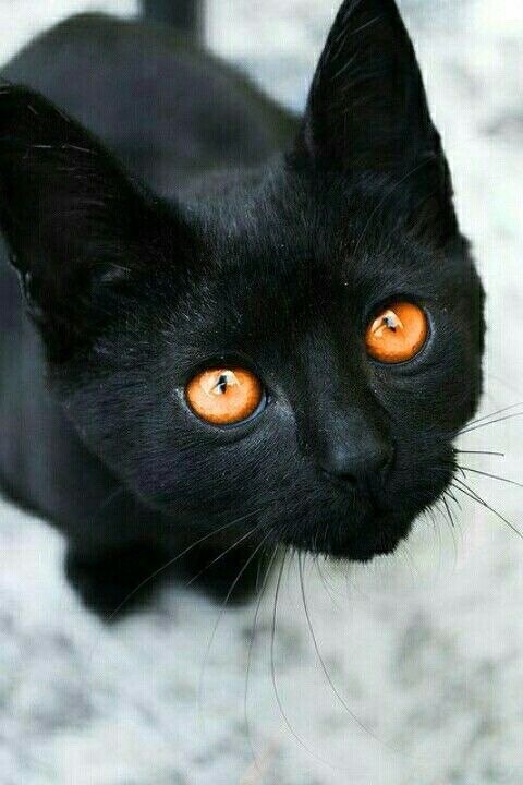
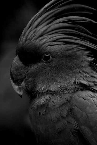
The easiest starting point is black and white.
These colours fall at extremes on the lightness/ darkness scale, creating the most gaping value contrast in the colour world.
The result is stark, static and severe.
Prominent at distance.
Noticeable in smaller proportions as well as to scale.
This is high value contrast.

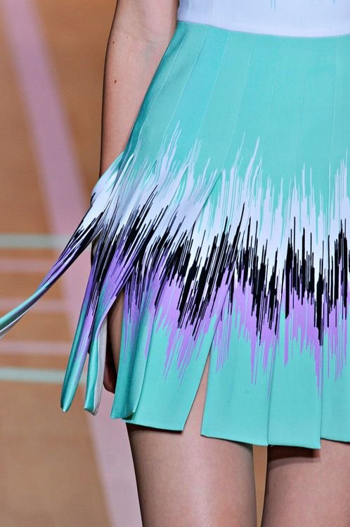
Super high value contrast doesn’t always have to be built from black and white.
But it does reference a combination that contains both very, very dark and very, very light colours.
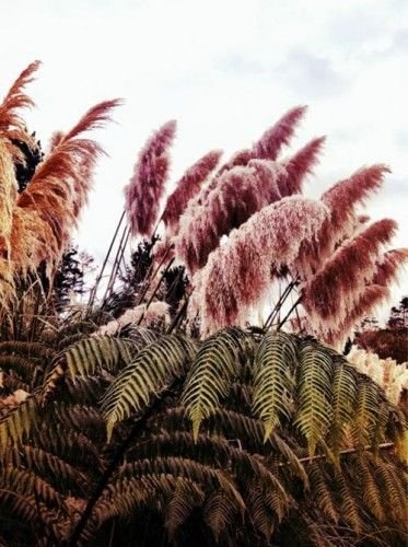
Greyscale is the typical way to showcase this effect.
Look at the gap between the lightest lights and the darkest darks in the photo pairings below.
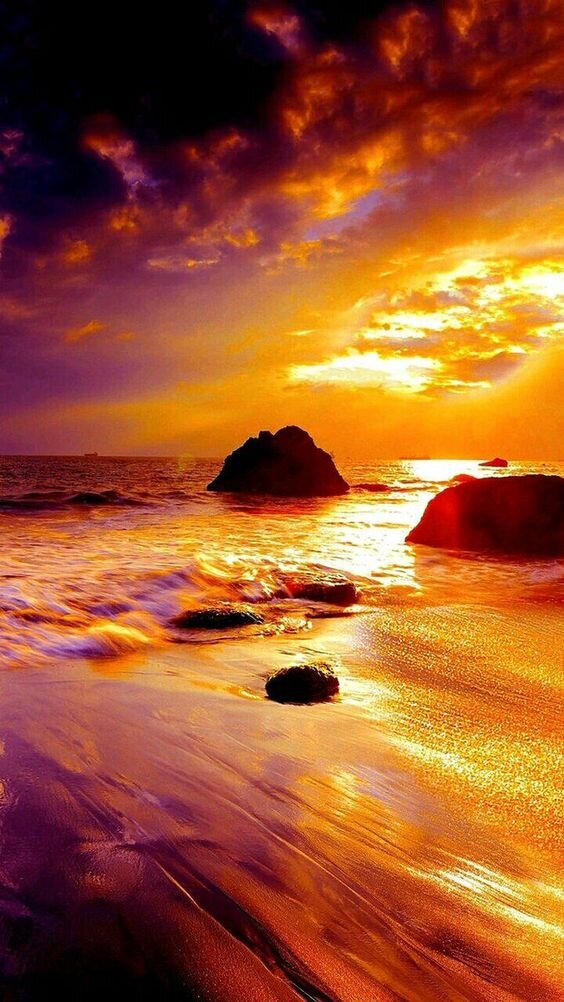
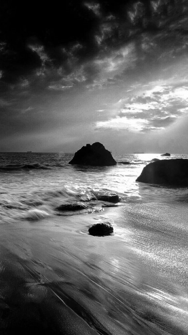
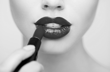
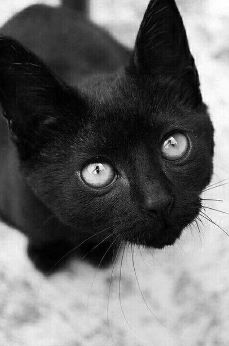
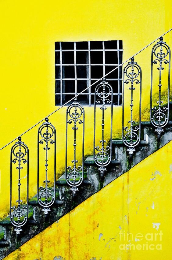
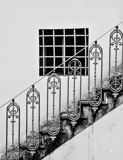
Here light and dark play off each other, creating high drama that’s crisp and graphic.
You’ll also note that alongside the extreme opposite expressions of value in these images, there is also a LOT of saturation.
That’s because we are talking about a colour space in the range of black and white, both of which are very bright.
So really extreme value contrast is also related to chroma (brightness).
Ok - so tell me about the opposite, you ask!
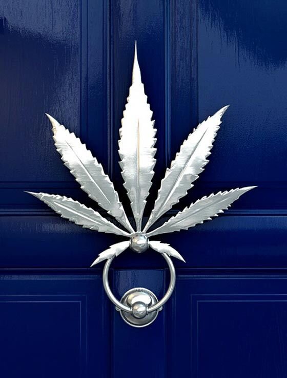
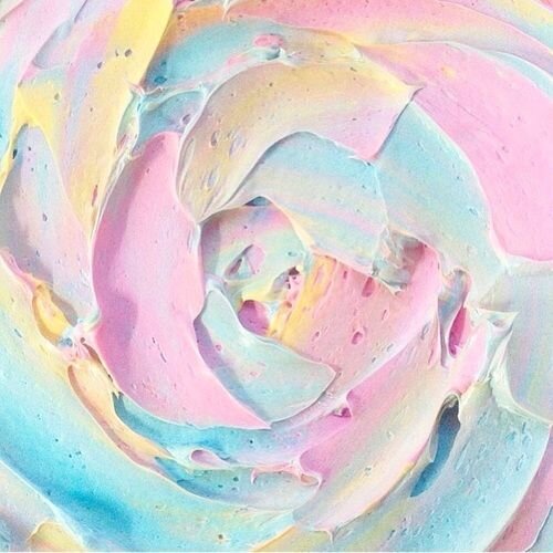
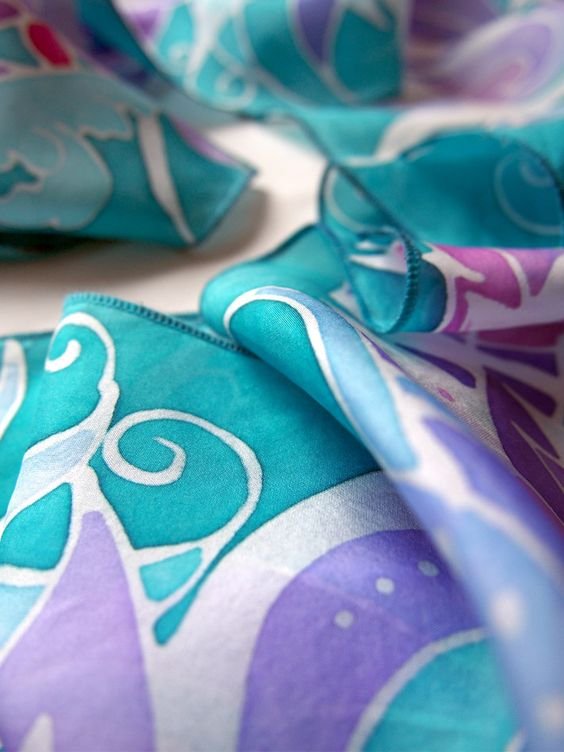
Low value contrast occurs when the gap between selected colours is much closer.
Everything is situated similarly on the lightness/ darkness scale.
Colours may be all dark, or all light, or all somewhere in between.
The result for low value contrast combinations is blended or even.

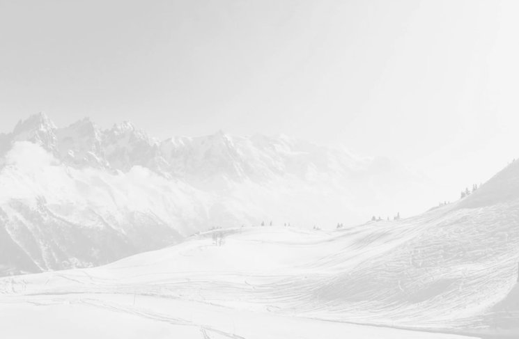
In each image there may be elements that are lighter or darker but compared with high value contrast, there isn’t the same extreme breaking up of colours.
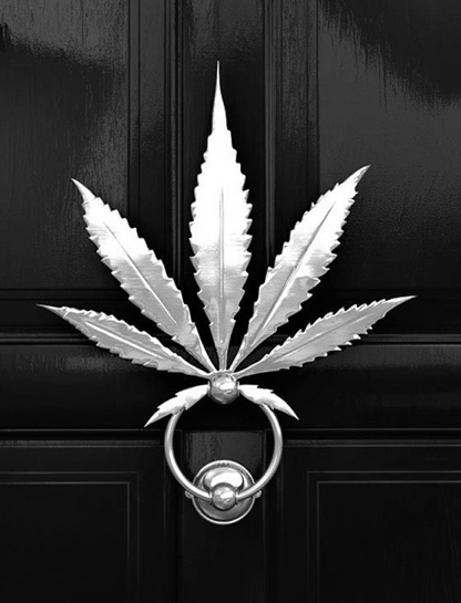
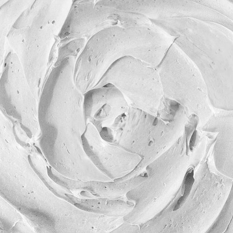
By going greyscale you can see that sometimes differentiation between colours is lost entirely.
This is further confirmation of the colours’ proximity to each other.
Some of these images are very high in value or very low in value but unless the two team up together, the overall result will be pretty uniform.
It’s the combination that matters.
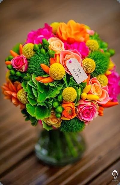
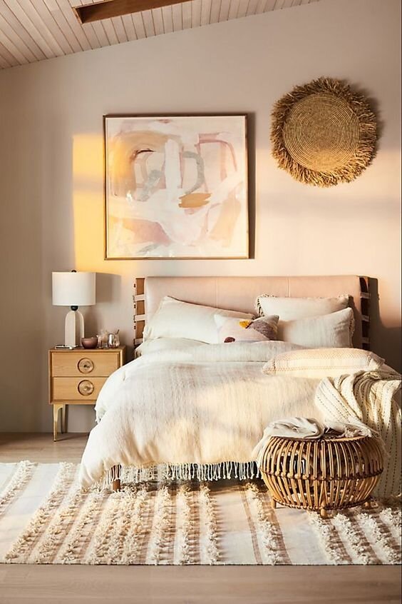
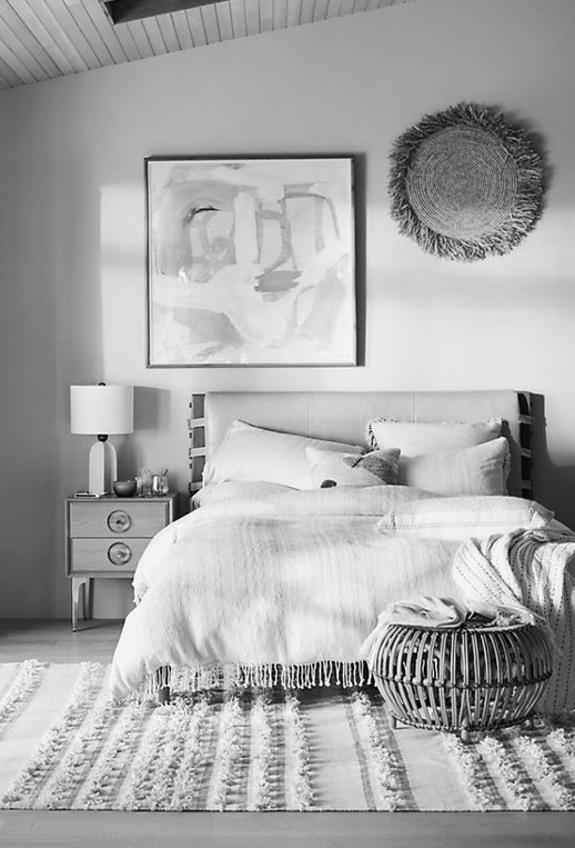
Low value contrast might also be expressed as a kind of “medium-ness”.
The bedroom image is neither particularly dark nor particularly light.
On the full scale between white and black, these tones are intermediate, with everything quite soft (low chroma).
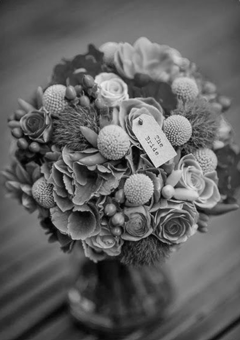
Compare it against the bright wedding bouquet.
The palettes and dimensions of these two images differ wildly but once we go greyscale, their shared relationship to medium value is revealed.
So for all these examples, the gap between each individual colour is relatively tight.
This is what low value contrast looks like.
Contextualising value contast
All seasons can wear a combination of lights with darks in a way that flatters their natural colour harmony.
But only some genuinely fall into the category where high value contrast plays a dominant role.
The vast space between black and white contains every single colour visible to the human eye.
Beyond black and white there is nowhere left to go.
Therefore the presence of both super high (light) and super low value (dark) in the same palette creates the opportunity for maximum possible value contrast.
Palettes that contain this quality are our Winters.
Consequently they are the most value-contrasting seasons.
(Although I’d venture Bright Spring deserves a special mention.)
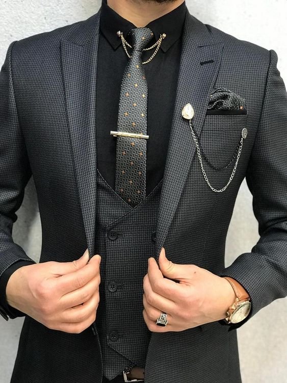
Winter people neutralise the intensity of black and white.
Before we move forward, let’s remind ourselves of what that actually looks like.
Here are three probable Winter men - a Dark, a True and a Bright - perfectly balancing black and white.


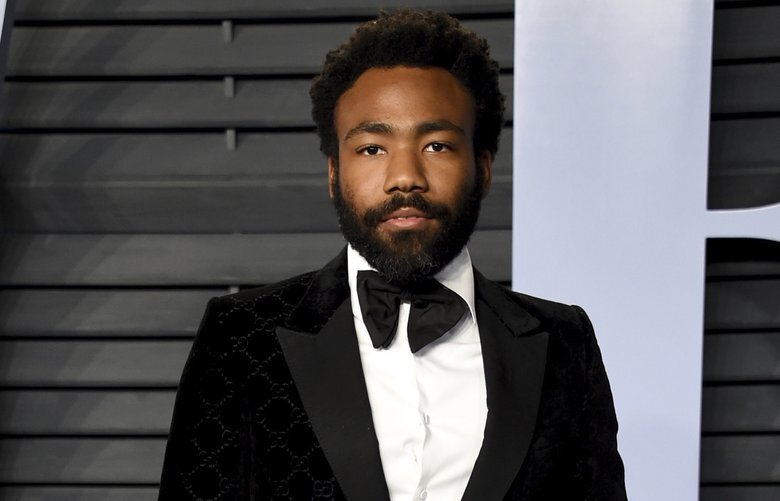
For Winters, black and white is the exact right amount of value contrast.
It’s extreme but so are they.
This isn’t the case for other seasons.
We are used to seeing men in tuxedos at fancy events and we recognise it looks sharp.
But that’s the cultural and aesthetic overlay we place on appearance.
It does not always reflect the reality of colour harmony.
The truth is that only our Winter friends are completely balanced in a classic black and white tux.
Value contrast beyond Winter
Winter value contrast is theatrical.
That’s the quality most people are trying to capture when they enter the Winter space.
But we can also take a more flexible approach to value contrast.
Let’s think about it in terms of how to combine the right kind of darks and lights.
When less naturally contrasting people wear value contrast that is true to their palette, the result is dynamic, engaging and no less dramatic.
Remember, every Tone has a version or sub for black and white.
Your dark might be someone else’s light, your light someone else’s dark.
So how might value contrast be expressed within a less extreme season?
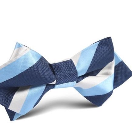
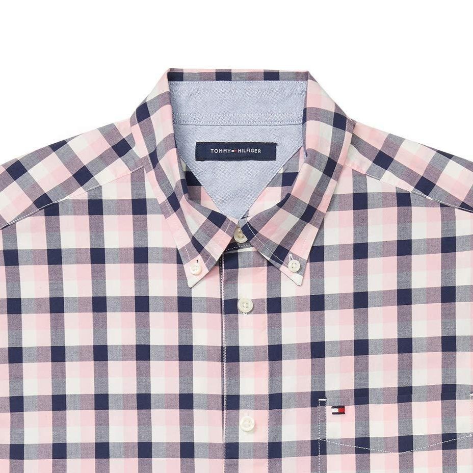
Let’s take a typically low contrast Tone like Light Summer.
Look at these colour pairings.


Light Summer sits at the very high end of the lightness scale.
Their darks are only medium in value when compared with the entirety of colour space.
But for a Light Summer, these colours will read as duly dark.
Which means that when combined with season-friendly lights, any of these colour pairings will read as duly contrasting as well.
On Light Summers and Light Summer only.
This is their sweet spot for value contrast.
Since real images often make more sense, let’s look at this concept from a different angle.
The images below contain the same colours as the examples above.
The colours may all be medium-light, yet there’s still a pleasing amount of contrast in each combination when viewed as a whole.

Unlike Winters, Light Summers are not extreme when it comes to value contrast.
Yet their palette still offers range.
There are colours here that read as light and colours that read as dark.
Normally we’d describe the dark stripe in that bow tie as navy blue and not give it a thought.
We aren’t holding the colour up against Winter navy which is loaded with saturation and actually quite different.
Even though we might use the same language and we might group them similarly in our minds as versions of dark blue, the two colours are nowhere near each other on the value scale.
So when worn as part of a balanced Light Summer outfit, we automatically note “dark blue”.
It doesn’t matter that there are other blues in the world that go way darker.
They aren’t characters in the Light Summer story.
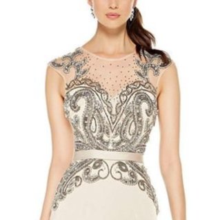
Here is the delightful Amy Poehler styled in a dark/light print that respects Light Summer’s value range.

Below are key colours lifted from Amy’s outfit.
That blue is plenty dark for a Light Summer while the soft pink-silver is a great sub for the season’s pearly white.
(For simplicity I left out the green.)
Compared with true black and white this collection of colours is not at all extreme.
Yet on Amy the impact of value contrast is alive and vibrant.

Low contrast seasons
Another less obviously contrasting group are the extreme Softs.
But even then, that’s only when viewing value contrast from a holistic vantage point that considers all colours at once.
We aren’t doing that when we look at a person.
When dressed harmoniously, we will see every element of that person as a single unified whole.
Respecting the Tone means understanding how contrast presents in its own unique way within that season.
When we do this, the effect has high energy; it’s exciting and dynamic.
Even when the colours seem faded or demure.
That’s what’s amazing about Soft seasons.
On a Soft person these colours are full and alive with value contrast very much present.
This is what high value contrast might look like for a Soft Summer:
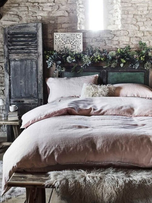

The colours in this picture of actress Cobie Smulders are corresponding nicely with the rustic bedroom.
This value contrast doesn’t look the same as crisp, dense, extreme black and white - but it doesn’t have to.
Our brain still reads the value combination.
This luxe, velvety mix of light and dark is a Soft Summer expression of value contrast.
Below Patrick Dempsey shows us another example of the same effect.
These layers of ashy pine and charcoal contrast beautifully against powdered chalk.
A milder example of value contrast that’s utter magic for a Soft Summer.

And just for fun, why not provide a soft-warm example as well?
Here’s Soft Autumn Ryan Gosling wearing value contrast in a very accessible way via check print.

Do you need value contrast in your outfit?
As a component of styling, this form of contrast is more important for palettes characterised by extremes of value.
That means that Winters really, really need value contrast to look their best.
All the time.
In every outfit.
Ever.
Winters might look flat when skipping value contrast.
Black may be in all Winter palettes but wearing it head to toe without any contrast at all might look a teeny bit boring.
Even on Dark Winters who can just about get away with it.
The reverse is also true with white.
Remember that theatrical, crisp, graphic quality?
This means tone-on-tone doesn’t offer quite the same punch for Winters as for other seasons.
But Winters, don’t despair.
Value contrast doesn’t need to be hard.
Colour blocking is always pretty fail-safe.
And when value contrast is this dramatic, using it in a simple or contained area will yield big results.
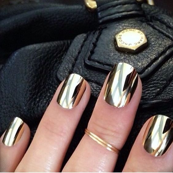
Hair, jewellery, shoes, neck ties, buttons, buckles, lipstick, scarves, pocket squares, belts, nail polish, eye shadow, stitching, prints, a logo.
We read natural colour harmony as a whole so even seemingly insignificant elements actually serve a key purpose.
And because it’s extreme and eye-catching, Winter value contrast is very visible.
This means crystal earrings, a touch of silver eye shadow, or a light coloured tie can do a lot of heavy lifting generating dimension in an otherwise all-dark or even medium-value outfit.
Flip this concept by grounding a very light or medium-value outfit with some dark.
Mixing up the value keeps a Winter looking exciting and alive.
And just remember, max contrast doesn’t have to be black and white every single time.
Flow between colours in softer Tones is more porous.
Layering versions of the same colour connects with their more subtle gradient in value.
Of course Winters can also wear light, medium or dark colours, monochrome or tone-on-tone.
The difference is that the presence of value contrast is critical for them to look truly polished and nail that magical “how are they doing it?” wow factor.
Even just for easy weekend wear.
Being Winter adjacent, I would suggest Bright Spring and Dark Autumn benefit greatly from the contribution of value contrast but it’s more a recommendation than a rule.
Other seasons probably have greater freedom.
For them value contrast exists as a styling option among many.
Final Words
Value contrast is a really useful way to add structure to your styling.
We can all enjoy its impact, no matter our Tone.
Just take particular heed if you hail from a season of value extremes!
Tailoring your level of darkness or lightness within your palette will give you the most flattering results.
There are clever ways to leverage value contrast so have some fun playing with your options.
Learning about value contrast will greatly expand your understanding of colour theory.
And ultimately, who doesn’t want another tool to make you look gorgeous?
