Value: dark or light
The concept of value is sometimes the trickiest.
The terms light and dark are used a little differently to everyday speech.
We are not talking about all whites and creams as “light” and all blacks and navy blues as “dark”.
Instead, think about the concepts of fresh versus rich, or weightless versus heavy.
A colour with high value is airy, luminous and feather-light.
Even the darkest colours from these palettes are youthful, delicate and effervescent.
Consider the following high value images:
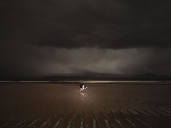
Now let’s take a look at some similar images with low value.
These palettes are full of dense, luxurious, jewel-like colours.
They feel deep and serious and might remind us of sumptuous old-world opulence.
They are a little edgy.
These colours are the opposite of the angelic, breezy, effortless high value palettes.
High value/ light colour palettes still have darks and low value/ dark colour palettes still have lights.
It’s just that as a group, the light palettes are closer to white and the dark palettes are closer to black – hence that feeling of weightless versus heavy or fresh versus rich.
To illustrate this point, let's compare some of these group’s lightest lights and darkest darks.
These colours are at the opposite ends of the value spectrum.
This ivory fabric looks quite brown and dark relative to the vanilla ice cream but in their palettes, these colours both function as versions of “white”.
The image of the sculpture is only medium in darkness level when compared with the very low-value picture beside it but in the fresh, airiness of a high-value palette, those colours play the same role as black.
That mid-level purplish taupe is plenty dark for some people.


