Mailbag: Brown leather jacket
/I recently analysed a smart, stylish True Autumn with fabulous hair.
(Her colourist ought to be congratulated!)
She is now in the process of incorporating True Autumn colours into her life.
Having already banished black - which is no small achievement - she is turning to brown as her go-to neutral.
Recently she came across a leather fisherman-style jacket perfect for her wardrobe.
But brown appears in lots of palettes.
How to be sure this one was right for True Autumn?
(Spoiler alert: it is True Autumn.)
My reply prompted my client to suggest re-purposing our conversation into this blog.
Great idea!
Today I’m offering suggestions for on-screen colour comparison and analysis.
Hopefully this post provides some useful tools, particularity for online shopping.
Let’s meet today’s outrageously cool guest.
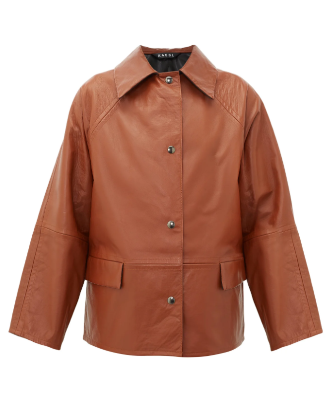
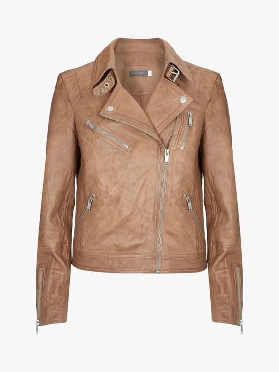
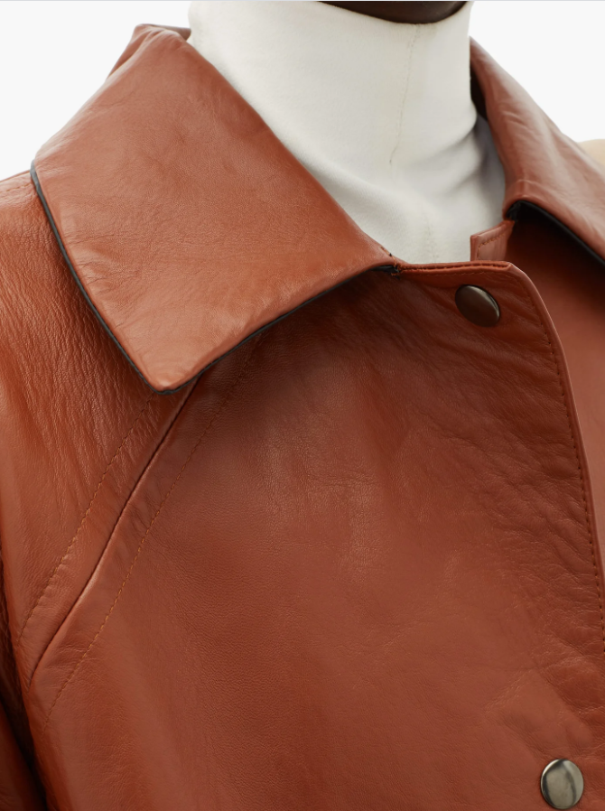
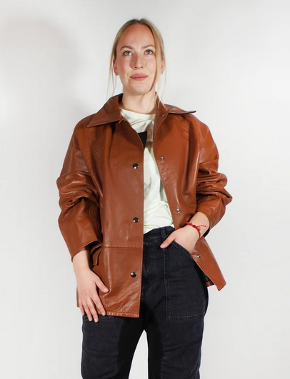
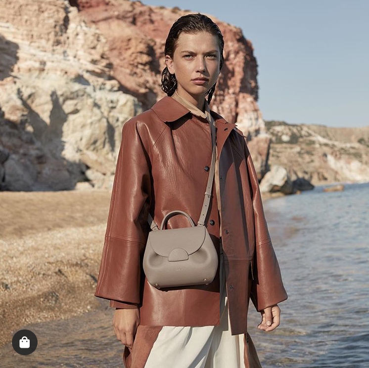
A Kassl Editions leather jacket.
The world around us
Sometimes a more strongly expressed dimension of colour will jump out before anything else.
My first impression is the jacket’s hue is warm.
Very warm.
This characteristic stands out even before I consider chroma or value.
It’s crying out for gold or brass buttons.
How is it I see warmth in this way?
Brown is a transition colour.
Colours we might call “brown” can be found at the intersection of some greys and greens, on the warmer side of taupe, or loitering around the edges of deep beige.
And brown frequently appears as a darker version of another colour, often orange or yellow.
In cooler seasons, yellow’s range is limited.
Although some cool-neutral yellows may seem kind of warmish at face value, none contain conspicuous orange.
A hint of apricot or peach maybe, but not orange.
So if there is a strong suggestion of orange in a colour, it’s likely you are looking at something warm.
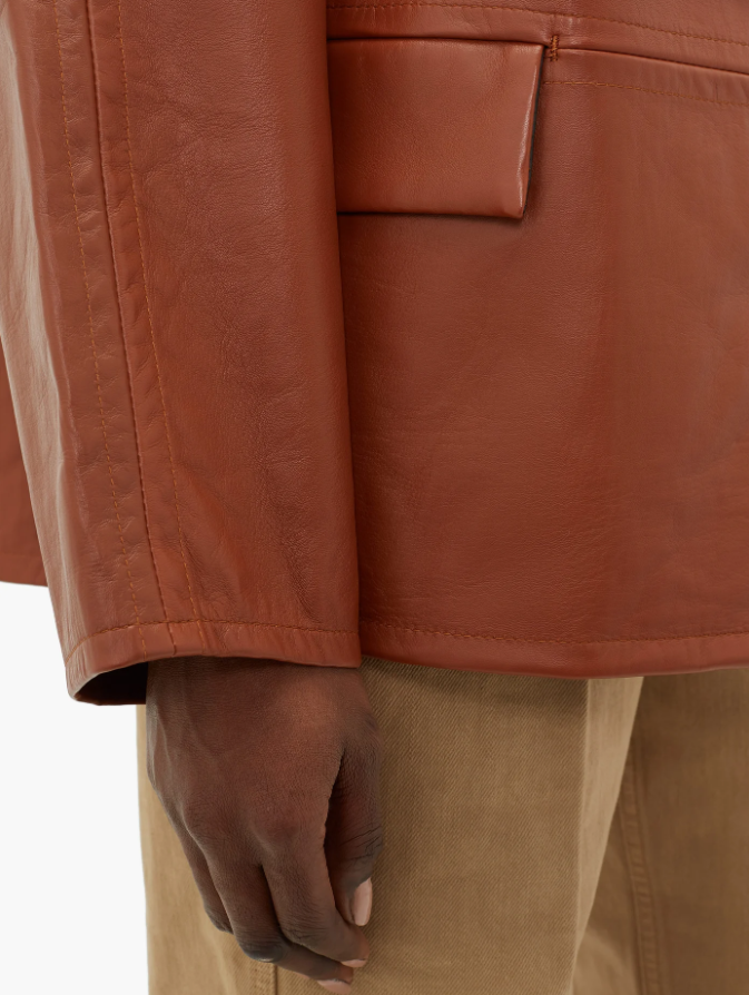
I see plenty of orange in our jacket.
It’s like marmalade has been added to walnut brown, turning the colour into something we might call burnt sienna or chestnut.
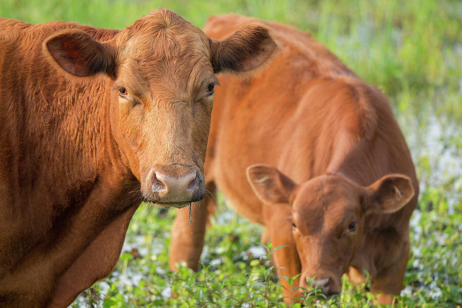
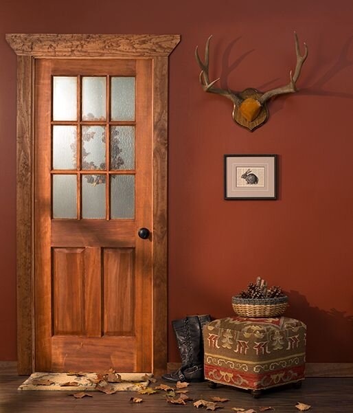
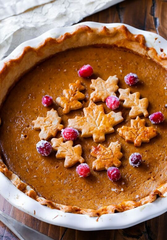
This colour immediately reminds me of log cabins and Red Angus cattle.
Imagining a colour in pictures and connecting it to the world around us is how my brain operates.
Once I have established a correlation between a colour and a real life parallel, the axis is set.
This allows me to return to the same mental reference point when I encounter that colour again.
Colour is extremely visual so for some of you, this technique might also work.
Scroll around my Pinterest page for guidance - or use your own pictures if you prefer.
You are looking for an equal relationship in hue, value and chroma between your item and the colours in the image.
Colour match photos until you find your bearings.
Compiling personal boards could be the making of you.
Don’t forget to think about what fine details like colour gradients, shadows or accents are telling you.
Our initial assessment of a colour is sometimes a bit off so I highly recommend cross referencing more than one image.
Never stop questioning the hue, value and chroma.
Build yourself a colour story.
You don’t have to be absolutely, totally, 100% exact on every single element.
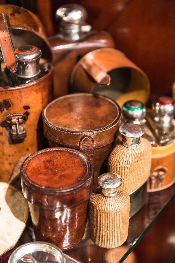
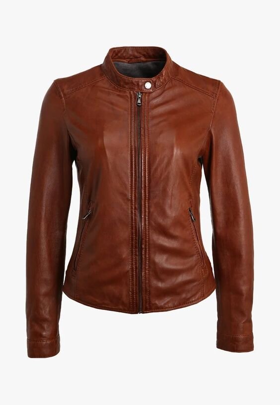
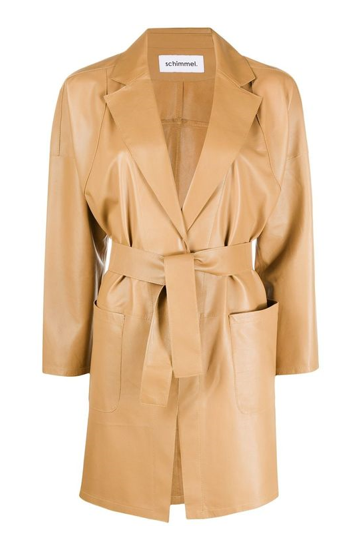
Not everything in this little photo gallery is perfectly True Autumn yet the chestnut colour is coming alive.
When colours share enough of the same qualities, even if there are small disparities, your brain will paper over any gaps.
Our brains love patterns.
They want colour to balance.
They are actively searching for colours to make sense in relation to each other.
Clashing colours take cognitive effort to process.
Harmonious colour patterns make life easy for our brains.
We are then rewarded with a sense of calm, concord and deeply satisfying beauty.
2. Like with like
What if imagining a leather jacket as a pumpkin pie or a log cabin just doesn’t make sense to you?
A side-by-side with similar items might be more meaningful.
However, this time it’s important your benchmark is completely accurate.
You don’t want to find yourself struggling to identify differences between two colours that are actually from the same palette.
Or discovering your comparison colour belongs to a different season from what you thought.
Keep asking yourself questions.
Which item is brighter?
What does low-value look like and is this an example of it?
Where does Item A fall on the cool-warm scale compared with Item B?
Again, explore Pinterest for vetted examples.
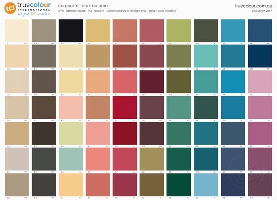
Here you can see just how “medium” True Autumn appears against super rich, super deep Dark Autumn.
Yet when compared with Soft Autumn’s distressed browns, our chestnut becomes dark once again.
Even more so against True Spring.
Look how luminous True Spring presents compared with True Autumn.
Equal heat level (hue), very different value and chroma.
3. Palette comparison
Ok so the hue of our jacket is warm.
That rules out Winter and Summer.
But we still need to consider all three dimensions of colour.
There are six warm seasons to cross reference.
All the palettes are available to view on the 12 Palettes 12 Seasons page of this website.
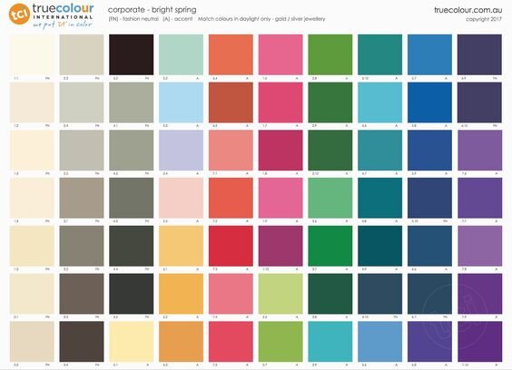
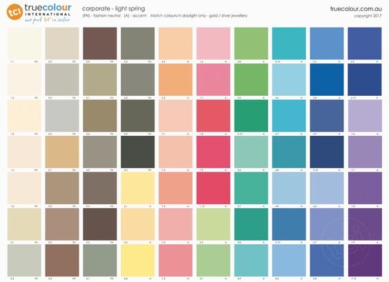
I’m immediately going to rule out Bright Spring and Light Spring.
Why?
Have a good look at these palettes.
Bright Spring doesn’t contain anything like our colour - plenty of taupe and some sugar pumpkin orange - but little you would call “brown”.
As for Light Spring, its powdery chocolate milk and coffee cream are a world away from our burnished chestnut.
There’s zero chance our jacket fits here.
Next we compare True Spring with True Autumn.
Both are super warm and contain plenty of yellow, orange and brown.
I clipped an image of the jacket and literally floated it over the on-screen palettes.
Where does the jacket “homogenise”?
Does the colour feel equivalent to the camel, peanut butter or Jersey caramel browns of True Spring?
How about against True Autumn maple or gingerbread?
This exercise is useful because it asks you to absorb the overall mood of the palette.
Trying to pick out an exact match from a single colour square isn’t always the most effective approach.
Palettes or fans can only display a tiny proportion of each season’s best colours.
Case in point:
I don't think there's an exact match in the True Autumn palette for this particular chestnut but that doesn't mean it isn’t True Autumn.
True Spring
True Autumn
Our jacket looks a bit similar in tone to one or two True Spring browns.
But when considering the palette more broadly, does it mesh with high-chroma, high-value turquoise, toffee apple or luminous peach?
Not only does True Spring look lighter in weight (value), it is brighter and, in a related outcome, more contrasting.
All of this reads as more “colourful” than True Autumn.
Take particular note of the difference in lighter colours between the two seasons (some are hiding behind the jacket).
There’s a delicate quality to True Spring’s clotted cream that is at odds with the robust density of True Autumn shortbread and latte.
Is the colour of our jacket delicate or robust?
Finally, we are left with the remaining two Autumn seasons.
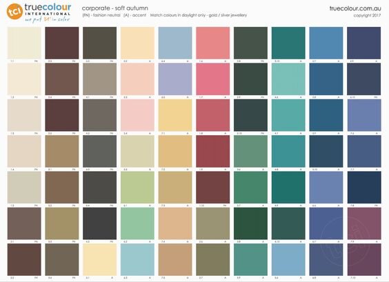
Soft Autumn browns are greyed or the muddy tones of peat and umber.
None are particularly orangey.
The hue of our jacket is glowing with heat and its value is deeper than this season’s gentle earthiness.
Good bye Soft Autumn.
Brown in the Dark Autumn palette is less common than you’d think.
It occasionally appears mixed with black as bitter chocolate, in lighter grain-toned beige, hinted at in burgundy, or very deep into yellow where turmeric becomes cognac.
Still, there are a couple of colours here that seem similar to our jacket, so maybe…
Go back and review the True Autumn palette.
Can Dark Autumn offer this same consistency in colour matching across the entire palette?
Dark Autumn is a bit irregular.
True Autumn offers the full mix and match.
4. Styling context
Sometimes, promotional images can give us important clues.
Focus on the colours surrounding an item and how they interact with each other.
Are they harmonious?
If not, what’s causing the conflict?
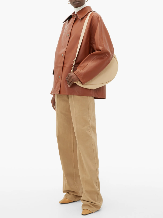
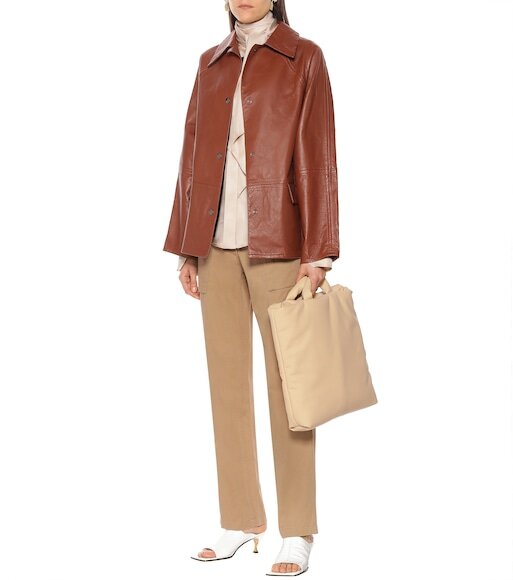
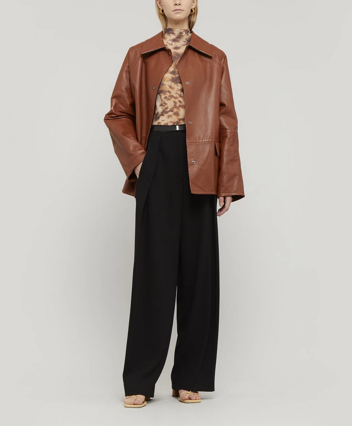
The website my client visited styled the jacket like this:
How does our jacket fare in the context of this outfit?
Remember, we are focusing on colour only.
I think it looks terrific with the chino-coloured trousers.
They are a yellow-based neutral in a deep, earthy way (Autumn), not in a light, creamy way (Spring).
As for the mustard shoes, they are a surprising and interesting styling choice.
Yellow is normally pretty noticeable.
But here it blends in with the trousers and bag, almost becoming another neutral.
Quite the stroke of genius.
A smart choice from a marketing perspective too.
Shoes in a contrasting colour might compete for our attention, detracting from the hero piece being sold - the jacket.
(Although in real life, brown shoes with this outfit would be fine.)
Consider the turtleneck.
That colour reads as white in the photo, but it's actually ivory.
Compare it with the white background of the website framing the photo for a clearer illustration of this point.
The turtleneck looks duller, a little tea-stained perhaps, and pairs inconspicuously with the jacket.
There’s no competition here between different elements of the outfit.
Someone who understands colour has constructed this look.
What's the overall impression of this colour combination?
Fabrics aside, there's a matte-ness present (Autumn) not a sunny radiance (Spring).
I see colours that are earthy and almost dirty - as if the colours have been out for a walk on a hot day.
Spring neutrals are brand new, crisp and sparkling clean.
Autumn's have utility, like they've been worn before.
That's the combination of chroma and value communicating to you.
Soft and deep.
When worn by a True Autumn this quality reads as smoulder, not shabbiness, and it’s unbelievably flattering.
Finally, that powerful golden undertone in everything that belongs only to True, not Soft or Dark Autumn.
5. Internet deep dive
Try broadening your search.
Sometimes you can find images of the same item with alternative styling.
This offers further opportunities for comparison.
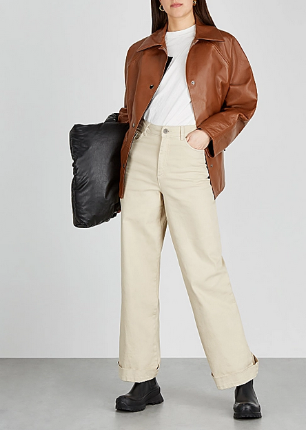
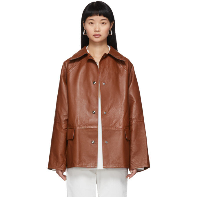
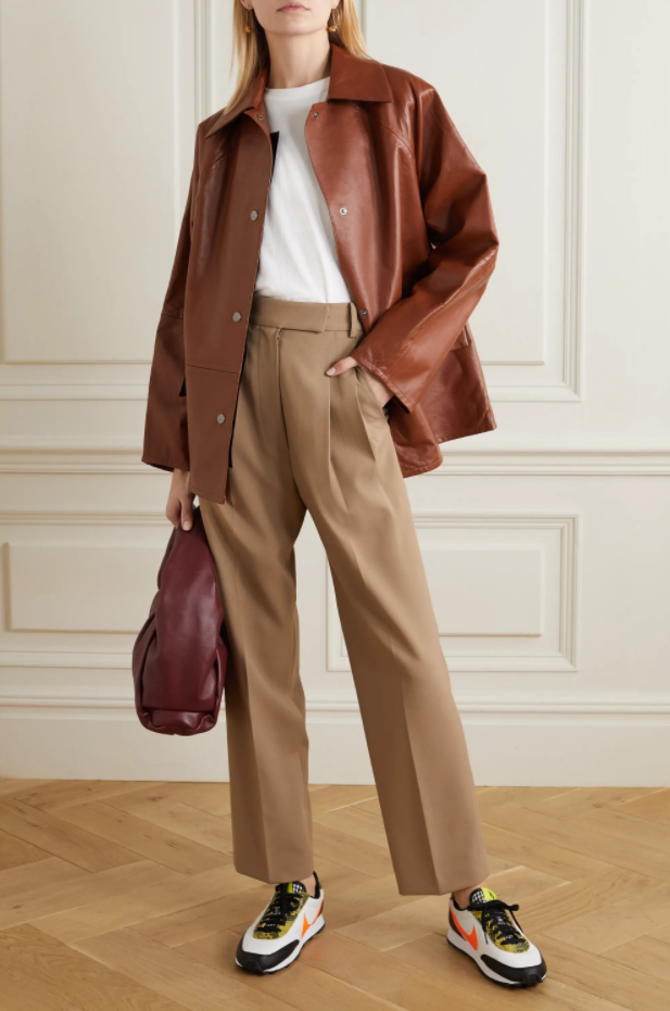
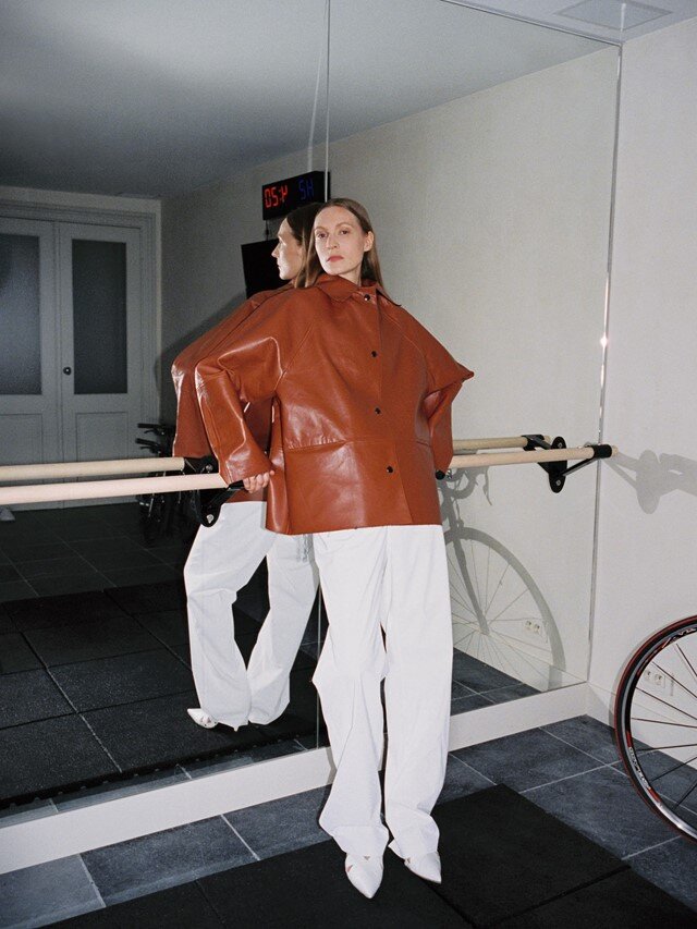
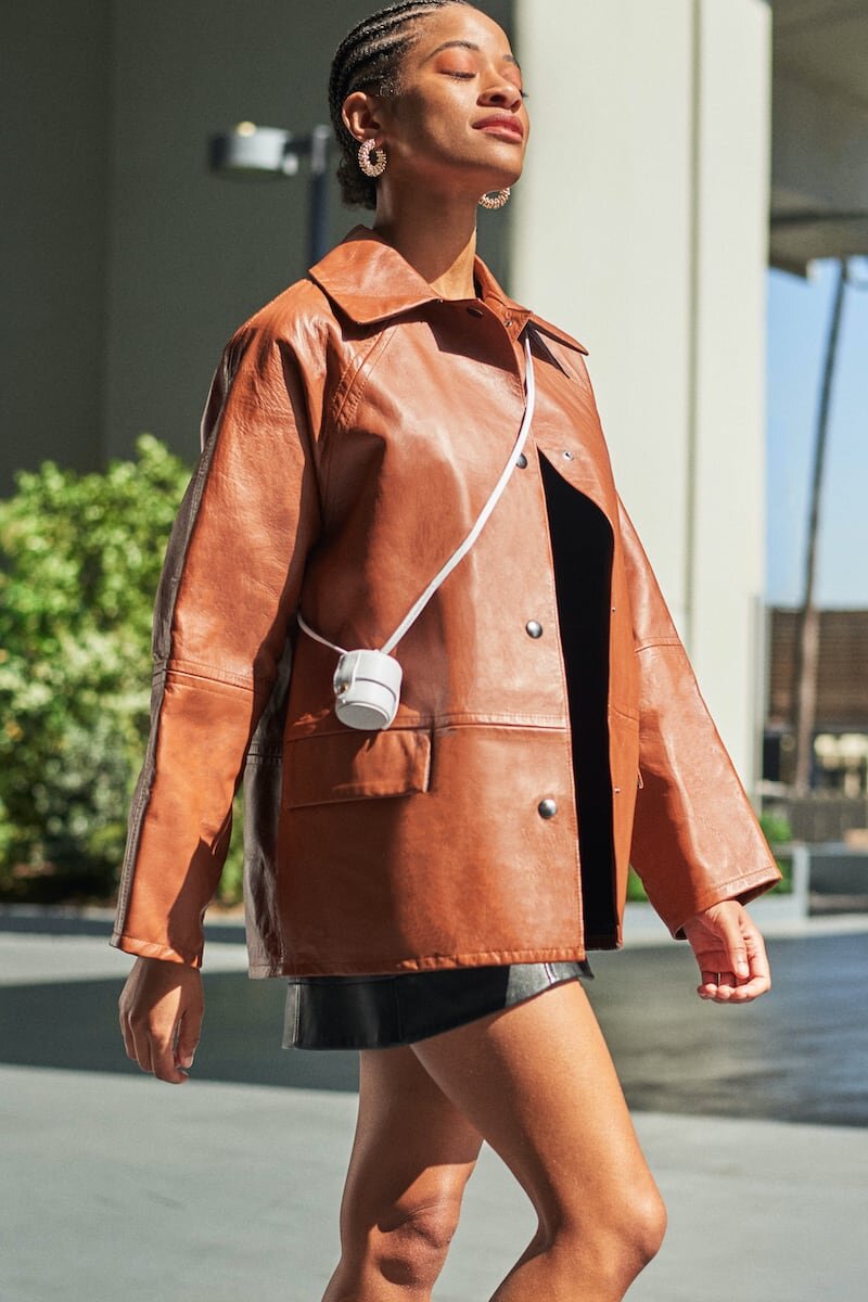
Here’s how our very same jacket appears for sale on other websites:
Now you have a direct comparison with black, white and other neutrals.
Black is better than white but not as good as brown.
A dead give-away for True Autumn.
Roaming the internet for additional photos is especially useful for brands that can be sourced through numerous stockists.
It’s likely each retailer will style the item a little differently.
But that’s not all.
Some brands invite customers to upload real world images of their purchases.
Check out street fashion, trend reports, magazine shoots or blogger sites.
Instagram can be a goldmine.
This is sometimes easier for boutique or designer pieces but not always.
There are plenty of affordable or high street brands profiled online as well.
This process doesn’t have to be onerous - a few key words into a search engine will do the trick.
Maybe you find something, maybe you don’t, but a quick check could pull up something surprisingly useful.
Just don’t forget to pay attention to the quality of light in the photos and be mindful of filters.
Case in point:
Here are 3 promo shots of our jacket created with different lighting conditions.
Note how much the colour changes with a filter in the third pic.
Final words
Online shopping can test your confidence.
But it also makes the whole world your department store.
In general, I think most quality retailers do a reasonably good job rendering colours as accurately as possible on their websites.
But it can still be a little hit and miss sometimes.
And as we know, monitors and devices can alter colours - so check your settings.
Employing a few tools that make sense to you will help frame hue, value and chroma when making decisions.
This practice sets your colour compass.
Eventually you may only need one or two quick cross references to check you’re on track.
We all learn, shop and process information in a little differently.
Experiment with what works best for you.
And enjoy the homework.
