Artistic Beginnings
Harmonious palettes are created by grouping colours that share the same levels of hue, chroma and value - the three dimensions of colour.
Naming groups of colours after seasons originated in Europe during the Impressionist movement of the 19th century.
For people familiar with higher latitudes of the northern hemisphere, this interpretation may feel very natural. For those in other parts of the world, the colour of seasons will look very different so we need to use a little imagination.
Visualise Spring as bright with fresh flowers and fruit, sunny and full of life.
Winter is cool and contrasting with lots of pure, jewel-like colours offset with black and white - think holly and snow.
Autumn is ablaze with cozy earth tones while Summer is relaxed and refined in watercolours and pastels.
The Impressionists used certain colours to create moodily seasonal paintings that captured the quality of light changing throughout the day and across the year.
Their understanding of colour, particularly in the European context, inspired the naming of our palettes.
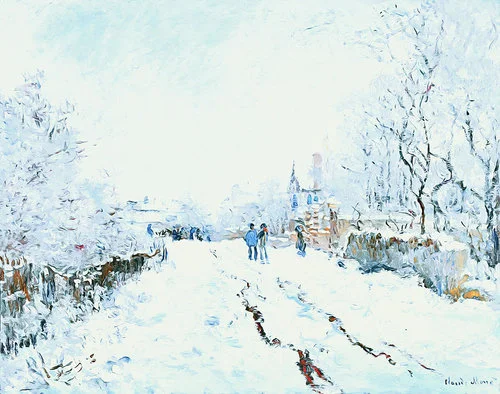
You can see how the great Impressionist Claude Monet interpreted light in the paintings below - Summer and Winter are cool with lots of blue-based colours. Autumn and Spring are warm with yellow-based colours predominating.
The hue of Autumn, Winter and Spring might make sense but because of the heat outside in Summer, we sometimes think of it as a warm season.
Try instead to consider the quality of the light, rather than the barometer reading. Summer can be hazy and shimmery, especially places like Australia, with a blended atmosphere that lacks deep shadows.
Like the Impressionists, it helps to think about this effect in terms of times of day.
In the morning, light is clear, bright and yellow-based. That's also what Spring looks like.
Around midday, the sun is high in the sky and light is scattered everywhere. There aren't many shadows in the middle of the day because the light is so evenly diffused. That soft, hazy, slightly drained light no longer contains any yellow. It has become blue-based Summer light.
As the day progresses, afternoon light matures, becoming rich and golden with lots of long shadows. That's Autumn.
And after sunset, into twilight, evening and night, the loss of yellow-based light reaching our eyes leaves only cooler blue light in a deep, ever-darkening space with lots of contrast between black sky and the stars or moon. Winter.
Look at these pictures. Don't focus on the colours or scenery in particular. Instead, think about the quality of the light.
Of course weather such as cloud cover, rain or mist, as well as your location, elevation or proximity to the equator, will influence how you experience light but this shift from yellow to blue light and back again is typical of the sun's movements both throughout the day and the year.
Monet was compelled to understand the changing personality of light, continually tinkering with this phenomenon in his art.
He was particularly interested in how a subject changed with the shifting light, famously creating more than 30 paintings in the Rouen Cathedral series that explored this idea.
Richard Silver is a New York photographer who has also explored this effect in his art.
You can see in his Time Splice series, how light presents and changes throughout the day.
Fresh, bright and luminous to the left of each image, the light transitions through a range of colour dimensions until turning deep blue with twilight.
So to summarise, the quality of light is cool and blue-based in Summer and Winter, and warm and yellow-based in Spring and Autumn.
Personal colour analysis continues the legacy of the Impressionists in attributing certain colour palettes with the seasons.


